Pot Gang
Brand Identity
May 2026
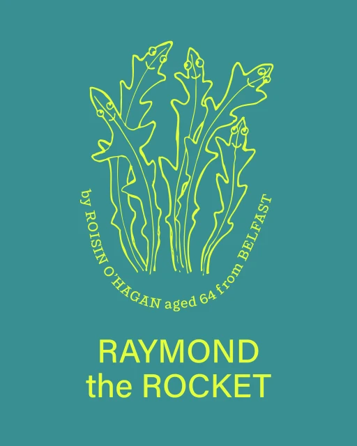
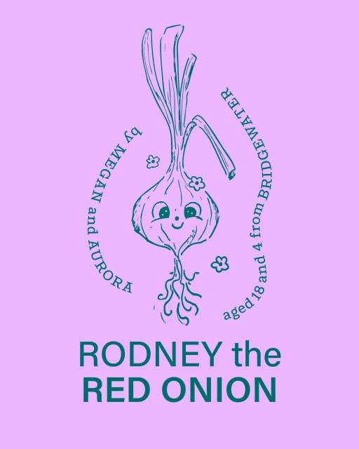
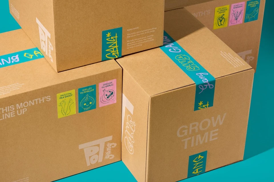
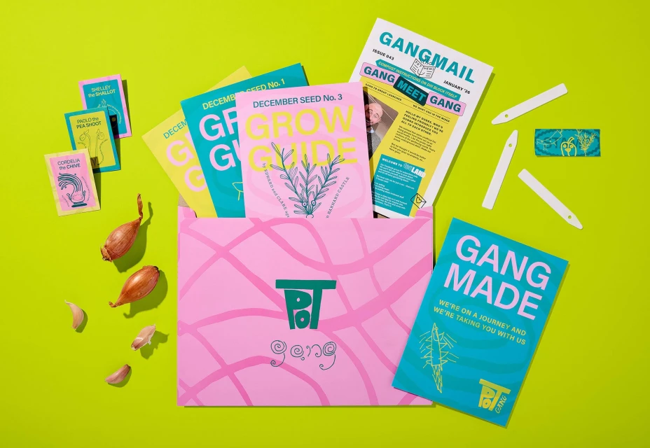
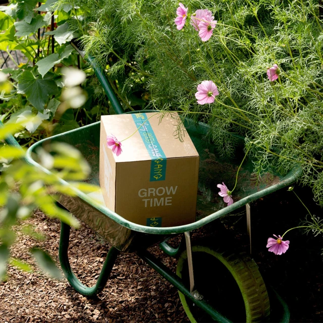
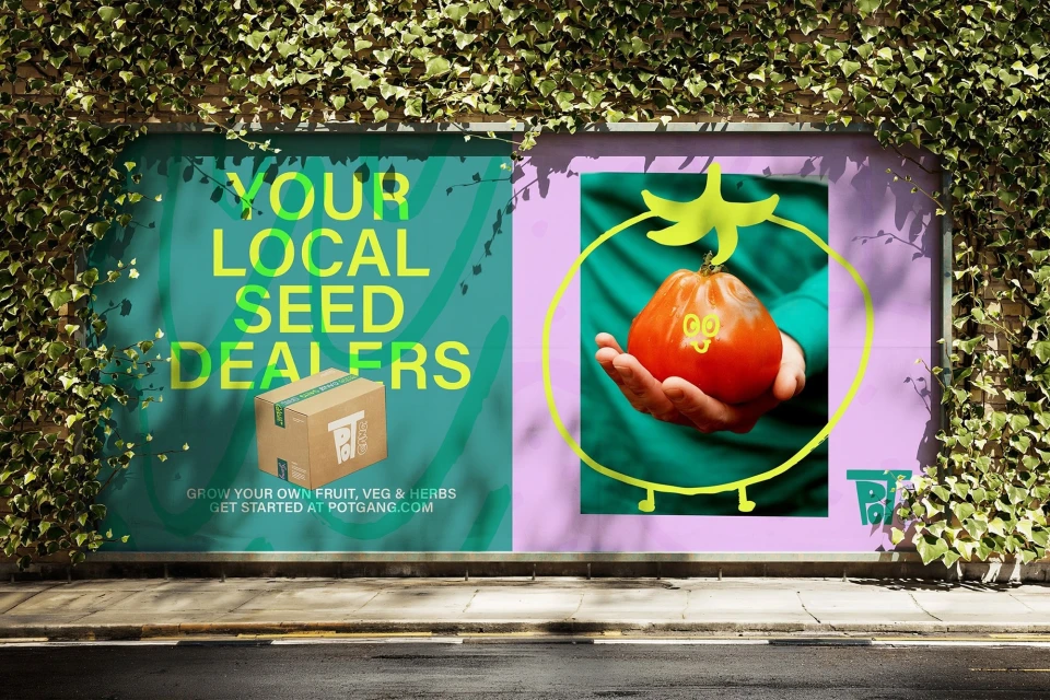
Pot Gang has successfully redefined the home gardening subscription model through a vibrant, high-energy brand identity that feels less like a chore and more like a community-driven movement. By leaning into a playful, character-led aesthetic, the brand bridges the gap between commercial horticulture and modern design, featuring a cast of anthropomorphic vegetable personalities—such as Raymond the Rocket and Gregor the Garlic—that transform mundane seed packets and shipping materials into engaging pieces of graphic storytelling. Executed with a sophisticated eye for layout, the brand identity utilizes a high-contrast color palette of neon greens and deep, muted teals to ensure every touchpoint, from outdoor billboards to flat-lay lifestyle photography, commands attention. This cohesive visual language is further elevated by the contributions of Land of Plenty on design, with motion pieces by Zac Waxman and Torren Tripp bringing the characters to life, while photography by Thom Atkinson and William Tisdall Downes captures the tactile, organic reality of the gardening experience. The project effectively uses vector illustration and bold typography to create a sense of belonging for a new generation of hobbyist growers. By blending functional packaging design with a whimsical, editorial approach, the brand successfully turns a simple delivery into a curated lifestyle experience that is as visually compelling as it is practical for the home gardener.
Clean, Graphic, Horizontal, Commercial
Solid Colour