
Amerikalinjen: Brand Identity


Mar 2020
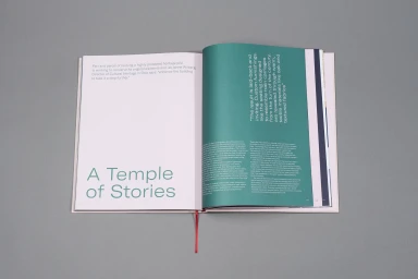
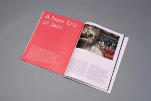
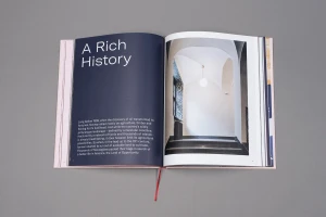
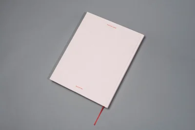
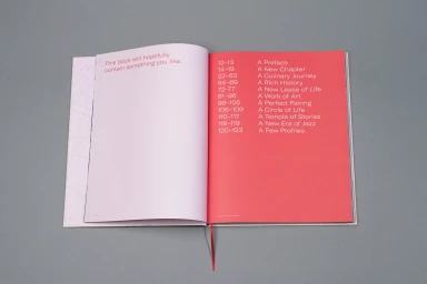
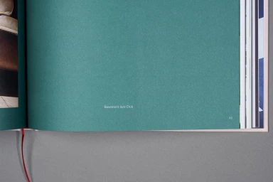
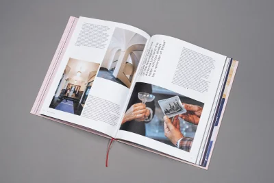
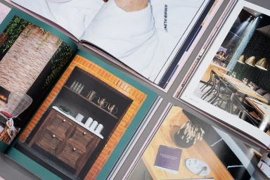
The brand identity for Amerikalinjen serves as a masterclass in editorial minimalism, grounding the hospitality experience in a tactile and sophisticated visual language. Through a series of carefully composed flat-lay photography and clean graphic design, the project channels an aesthetic that balances historical weight with modern fluidity. The identity utilizes a distinctive palette—pairing muted, neutral greys and soft pastels with striking pops of vibrant red and teal—to create a sense of place that feels both curated and archival. As a commercial project, it excels in presenting high-end stationery and brand manuals that prioritize typography and negative space, reflecting the refined character of a boutique destination. Techniques such as emboss and deboss applications, coupled with high-key natural lighting, elevate the physical materiality of the brand collateral, making even a simple notebook feel like a premium keepsake. The editorial layout, punctuated by sharp sans-serif type and professional photography of contemporary interiors, demonstrates a cohesive vision for the brand. With expert graphic design work by Scandinavian Design Group, the project moves seamlessly between institutional history and the warmth of modern hospitality. By integrating lifestyle elements alongside structured corporate documentation, the identity establishes an atmosphere of understated elegance that is consistently reflected across every touchpoint, from room stationery to detailed architectural spreads.
Horizontal, Commercial, Clean
Typography
Grey Seamless
