
Fagbokforlaget: Brand Identity
Jan 2021
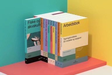
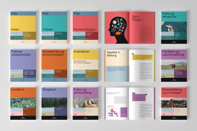
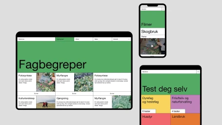
Fagbokforlaget presents a comprehensive brand identity across digital and print media, developed in collaboration with Scandinavian Design Group. The project integrates a vibrant, contemporary aesthetic, utilizing a bold color palette of coral, teal, yellow, and purple to unify educational materials and digital platforms. Scandinavian Design Group implemented a structured typographic grid and consistent color-blocking, bridging the gap between textbook layouts and digital user interfaces. The visual language leans into minimalist principles, featuring clean lines and vector illustrations that reflect a modern editorial approach. Photography by Marthe Thu captures the collection through both clean studio setups and composed flat lays, highlighting the interplay between graphic design, motion graphics, and editorial photography.
Horizontal, Commercial, Clean, Minimalist

