
Feeld
Featured Feeld projects
This week's top Feeld projects, carefully handpicked by Visie's expert curators, showcase the best in style and innovation.
 Project
 Feeld · Brand Identity
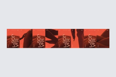
The latest brand identity overhaul for the digital platform Feeld expertly navigates the intersection of human intimacy and structural precision, establishing a visual language that feels both visceral and highly organized. Crafted by the design team at Two Times Elliott, this comprehensive project leverages a bold, high-contrast color palette of vibrant coral orange and deep earth tones to anchor the brand within the competitive apps and digital platforms landscape. Through a sophisticated integration of commercial graphic design and typographic rigor, the identity leans into a minimalist aesthetic that prioritizes clarity and geometry. The execution utilizes a blend of abstract, tactile photography of human forms alongside rigid grid systems and vector graphics, which together communicate the brand’s core values of curiosity and openness. By pairing the organic softness of skin and natural shadows with the sharp, clean lines of sans-serif typography, the visual identity successfully creates a contemporary, polished interface that feels grounded in real-world human experience. From billboard-scale applications featuring live-action techniques set against gritty urban backdrops to smaller, refined UI illustrations, the project demonstrates a versatile and cohesive visual strategy. This holistic approach ensures that Feeld remains distinct, relying on a sophisticated interplay between fluid, human-centric imagery and a structured, modern layout that effectively resonates across both digital and physical environments.
 Project
 Feeld · Brand Identity
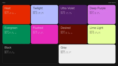
The brand identity project for dating app Feeld serves as a comprehensive overhaul of the platform's visual system. Created in collaboration with graphic design studio Made Thought and photographer Molly Matalon, the project introduces a fluid, expressive aesthetic that bridges digital interface design with tactile brand assets. The execution leans into vibrant, saturated color gradients—spanning magenta, lavender, and neon green—to create a distinct visual language across both app and out-of-home touchpoints. The work incorporates variable typography and minimalist motion graphics, emphasizing a clean, deliberate approach to digital interaction. Imagery throughout the campaign features candid, documentary-style photography alongside studio-captured lifestyle shots that ground the platform’s abstract motifs in human connection. By utilizing high-contrast lighting and organic textures, the identity establishes a cohesive look that functions across mobile UI, street-level signage, and large-format advertising.
 Project
 Feeld · Brand Identity
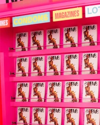
Feeld explores the intersection of intimacy and editorial design with its comprehensive brand identity, centered around a curated print publication. The project utilizes a vibrant, high-key color palette dominated by saturated magenta and yellow, channelled through retail installations, street-level newsstands, and a structured, typography-heavy layout. Creative direction and design for the project were led by Blok Design, with additional creative and art direction from Feeld, Andrew Peet, Siavash Khasha, Nyomi Warren, and Julia Quesnel Welch. Editorial content is helmed by editors Maria Dimitrova and Haley Mlotek, supported by contributing editors Seb Emina, Jazmine Hughes, and Lucy McKeon, and poetry editor Kathryn Maris. The visual language blends clean, graphic editorial storytelling with candid, documentary-style photography.
Explore other brands
Explore Visie’s leading industries, projects, and the talented creatives representing them.





