Sonos
Featured Sonos projects
This week's top Sonos projects, carefully handpicked by Visie's expert curators, showcase the best in style and innovation.
Sonos · Love the Sound. Feel the System
Sonos explores the intersection of precision engineering and human experience in the campaign titled Love the Sound. Feel the System. The commercial spotlights a range of audio hardware, including speakers, subwoofers, and headphones, presented through a blend of technical schematics and lifestyle vignettes. Technically driven by 3D render / CGI and motion graphics, the film maps the connectivity of a multi-room setup against vibrant pastel backgrounds. The narrative leans into the relationship between diagrammatic soundwave illustrations and the reactions of individuals engaged with their home audio environments, maintaining a clean aesthetic throughout the presentation.
Sonos · Shatter The Silence
Sonos explores the intersection of isolation and connection in this brand film, Shatter The Silence. The narrative moves from intimate portraits to the rhythmic lights of residential exteriors, establishing a narrative that leans into a moody aesthetic. The project utilizes a cinematic, low-key lighting approach, defined by cool, desaturated tones and soft bokeh effects. William McVay managed the post-production and visual effects for the piece.
Sonos · Sonos Play
This commercial campaign for the Sonos Play portable speaker showcases the device's utility in diverse environments, ranging from home interiors to rugged outdoor settings. The visuals focus on the physical build of the speaker, highlighting tactile buttons and the integrated carrying strap through macro close-up shots. The execution relies on clean commercial lighting to emphasize the speaker's design details, punctuated by dynamic sequences of water interaction. Post-production and VFX were managed by Frame48, ensuring a polished aesthetic throughout the live-action production.
 Project
Sonos · Brand Identity
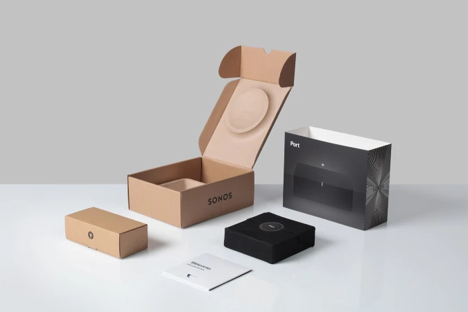
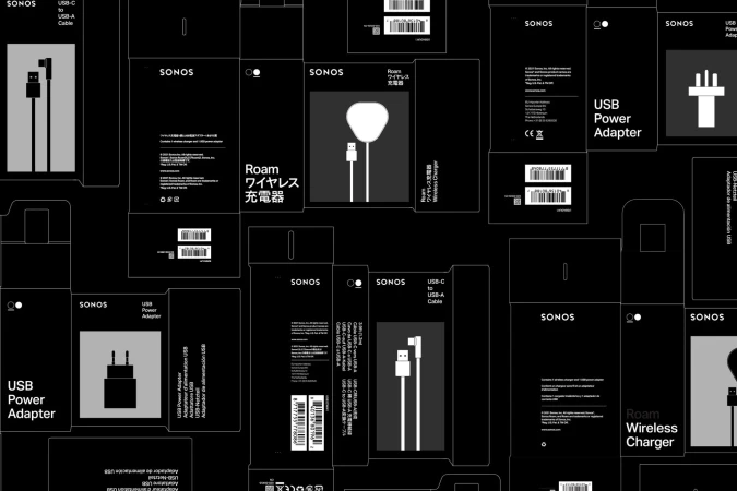
Sonos has long defined the intersection of premium sound and sleek industrial design, a legacy that extends seamlessly into its latest brand identity project. By stripping away visual clutter, the execution emphasizes a disciplined commitment to commercial minimalism that reinforces the brand's position at the vanguard of the consumer electronics and technology sector. The project showcases a suite of product photography and packaging design that leans into editorial clarity, utilizing high-contrast, black-and-white palettes to command attention. Every frame, from the matte-finish packaging of the Amp and Port devices to the tactile, soft-touch fabric of the Move speaker sleeves, serves to humanize the hardware. The compositions rely on soft light and natural light to elevate mundane cardboard and plastics into objects of desire. Through a rigorous use of Typography, the branding anchors each piece with bold, sans-serif precision that creates a distinct, radial graphic identity across the line. With sophisticated graphic design by Hype Type, this visual system feels both functional and aspirational, balancing the structural geometry of the boxes against the fluid, organic motion suggested by their starburst motifs. Ultimately, this body of work successfully translates complex technological utility into a clean, cohesive visual language that remains consistent across every touchpoint, proving that in a crowded market, the most powerful communication is often the most refined.
 Project
Sonos · Brand Identity
Sonos updates its brand identity through a cohesive series of product packaging designs. Developed in collaboration with Hybrid Design, the project replaces standard enclosures with custom kraft paper packaging, prioritizing sustainable materials and a refined visual language. Photographer Rob Williamson captures the collection across a variety of settings, from polished wooden surfaces to neutral marble. The imagery leverages natural light and high-contrast shadows to highlight the tactile textures of the recycled paper, pairing them with minimalist typography and precise graphic icons that detail the included accessories. This commercial work serves to unify the consumer electronics brand's presentation through clean lines and geometric order.
Sonos · Behind the Flame
Sonos · Feel Sound All Around
Explore other brands
Explore Visie’s leading industries, projects, and the talented creatives representing them.