
Sonos: Brand Identity
Nov 2019
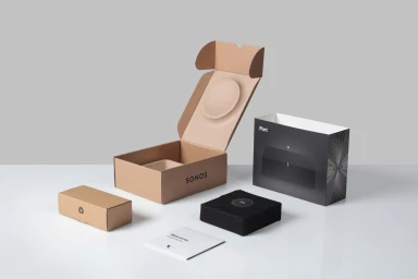
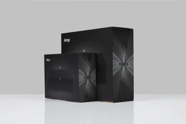
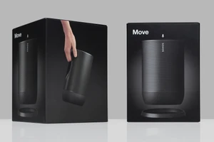
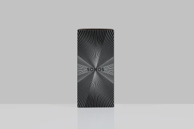
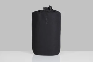
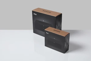
Sonos has long defined the intersection of premium sound and sleek industrial design, a legacy that extends seamlessly into its latest brand identity project. By stripping away visual clutter, the execution emphasizes a disciplined commitment to commercial minimalism that reinforces the brand's position at the vanguard of the consumer electronics and technology sector. The project showcases a suite of product photography and packaging design that leans into editorial clarity, utilizing high-contrast, black-and-white palettes to command attention. Every frame, from the matte-finish packaging of the Amp and Port devices to the tactile, soft-touch fabric of the Move speaker sleeves, serves to humanize the hardware. The compositions rely on soft light and natural light to elevate mundane cardboard and plastics into objects of desire. Through a rigorous use of Typography, the branding anchors each piece with bold, sans-serif precision that creates a distinct, radial graphic identity across the line. With sophisticated graphic design by Hype Type, this visual system feels both functional and aspirational, balancing the structural geometry of the boxes against the fluid, organic motion suggested by their starburst motifs. Ultimately, this body of work successfully translates complex technological utility into a clean, cohesive visual language that remains consistent across every touchpoint, proving that in a crowded market, the most powerful communication is often the most refined.
Horizontal, Commercial, Clean, Minimalist
Grey Seamless
E-commerce / Product
