

Mohawk
Featured Mohawk projects
This week's top Mohawk projects, carefully handpicked by Visie's expert curators, showcase the best in style and innovation.
 Project
 Mohawk · Brand Identity
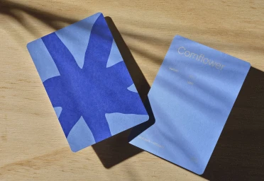
Mohawk’s brand identity project showcases an extensive range of paper samples and collateral, emphasizing the intersection of tactile design and print production. The collection features a variety of swatch books, geometric packaging, and die-cut cards that explore texture through the use of natural light and clean, minimalist compositions. Designed by Hybrid Design, the project highlights specialized printing and binding techniques, including emboss and deboss finishes. Photographer Rob Williamson and stylist Megan Petrilla capture these materials across diverse table settings, incorporating organic paper art and studio workspace elements to demonstrate the versatility of the brand's paper stock.
 Project
 Mohawk · Brand Identity
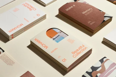
This brand identity project for Mohawk presents a comprehensive visual system designed by Hybrid Design. The collateral focuses on the tactile properties of specialty paper stocks, utilizing clean typography and structured grid systems to showcase the brand's diverse range of textures and finishes. Photographed by Henrik Kam, the series highlights promotional brochures and swatch portfolios through minimalist compositions. The execution leans into a natural light aesthetic, incorporating techniques such as screen printing, blind embossing, and arched die-cuts to create depth within the print materials. These design elements emphasize an earthy color palette and careful attention to negative space, reflecting a methodical approach to print collateral.
 Project
 Mohawk · Brand Identity
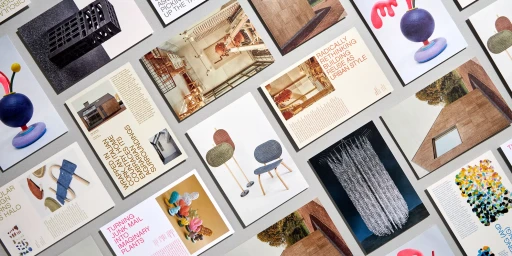
Mohawk’s brand identity project serves as a showcase for high-end paper manufacturing, blending tactile materiality with editorial precision. Developed by Hybrid Design, the collateral explores the intersection of sustainability and print production through a series of layered layouts, die-cut booklets, and material sample packaging. The identity leans into clean, minimalist graphic standards to elevate technical paper specifications into a cohesive visual language. Captured by photographer Henrik Kam, the imagery utilizes natural light and sharp, rhythmic compositions to highlight the physical grain and texture of the paper stocks. By incorporating collage techniques and bold, structured typography, the project functions as both a brand manual and a medium for artistic documentation. The work emphasizes the tactile quality of the collection, using subtle shadows and deliberate spacing to frame archival photographs and sculptural illustrations within a professional editorial context.
Explore other brands
Explore Visie’s leading industries, projects, and the talented creatives representing them.





