
The Vandelay: Brand Identity


Mar 2021
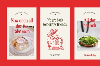
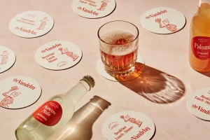
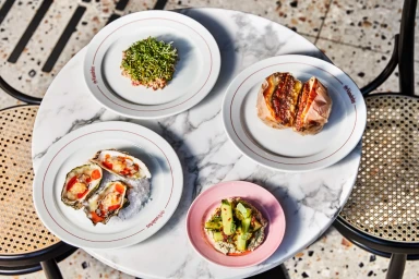
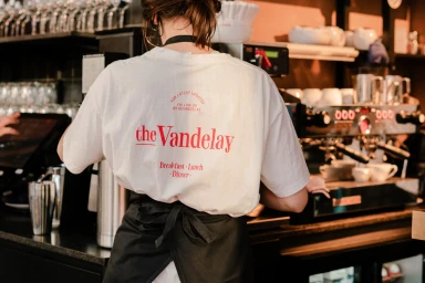
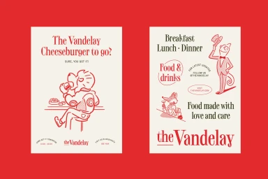
The Vandelay brand identity project establishes a visual system for the hospitality space through a blend of commercial graphic design and tactile branding. Developed with design studio Bielke&Yang, the project utilises high-contrast typography and a distinct red-and-green colour palette to frame the brand's presence across print collateral and digital assets. Central to the visual identity are whimsical red line illustrations by Ryo Kaneyasu, featuring anthropomorphic characters that appear on coasters, posters, and takeaway packaging. These vector graphics complement a series of lifestyle and food photography shots that highlight the restaurant's culinary offerings against a backdrop of natural light and clean textures.
Clean, Horizontal, Commercial
Solid Colour
Advertising Campaign

