
Atelier: Brand Identity
Nov 2021
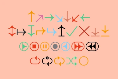
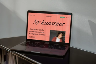
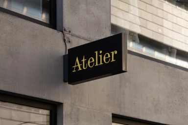
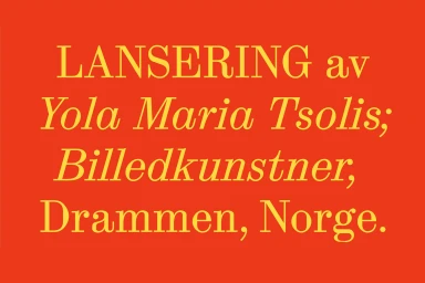
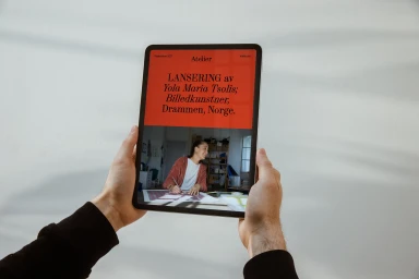
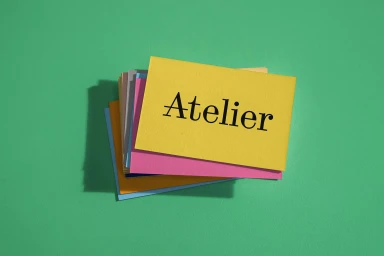
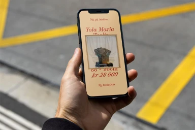
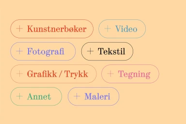
Atelier’s brand identity, developed by Bielke&Yang, functions as a comprehensive visual system defined by minimalist icon design and clear typography. The project balances a vibrant, multi-layered palette with clean composition, utilizing vector elements and precise motion graphics to create a cohesive digital and physical presence. From modern storefront signage mounted on raw concrete to a tactile suite of printed paper cards, the visual language remains consistent through its use of bold serif type and chromatic variety. The digital components, including web and mobile interface designs, emphasize a minimalist approach to content organization, with layout structures that feature soft, natural light and warm-toned backgrounds.
Horizontal, Commercial, Clean
Typography
