
unknown: Brand Identity
Mar 2020
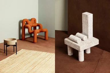
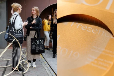
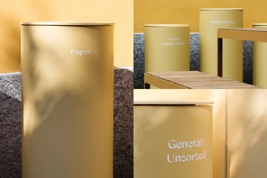
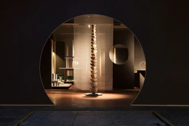
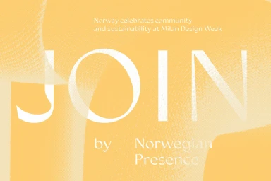
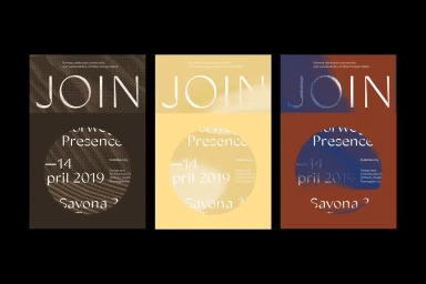
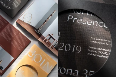
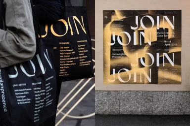
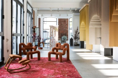
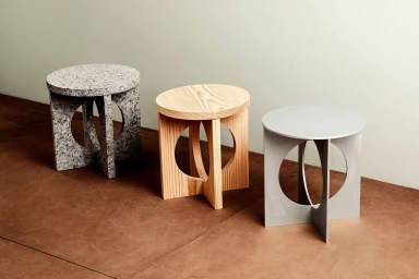
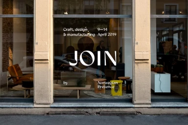
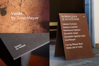
This comprehensive brand identity project for the Norwegian Presence exhibition at Milan Design Week stands as a masterclass in spatial storytelling and graphic precision. Developed by the studio Bielke&Yang, the initiative seamlessly merges commercial branding with an artistic, editorial sensibility. The visual language centers on the theme of connection, encapsulated by the repeated use of the word JOIN, which appears across diverse mediums ranging from high-contrast signage to tactile exhibition brochures. By utilizing a sophisticated palette of muted yellows, rusted reds, and deep blacks, the project leans into a minimalist aesthetic that honors Scandinavian design principles through a lens of sustainability and community. The execution masterfully leverages style techniques such as emboss & deboss, intricate halftone dot patterns, and live-action technique to ensure every touchpoint feels deliberate and elevated. Whether applied to functional objects like pastel waste bins or sprawling outdoor urban posters, the typography remains the constant, stabilizing anchor of the identity. The branding process excels in its physical application, utilizing natural light to highlight the raw, organic material qualities of the stone sculptures and textured papers showcased throughout the space. By balancing architectural geometry with refined craft, this work transcends simple corporate graphics, creating a cohesive, professional ecosystem that invites visitors to engage deeply with Norwegian culture, craftsmanship, and forward-thinking design narratives.
Horizontal, Clean
Natural light, Typography
Advertising Campaign
