
Soft: Brand Identity


Feb 2020
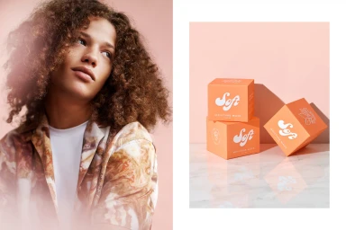
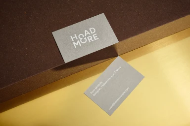
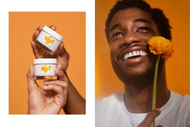
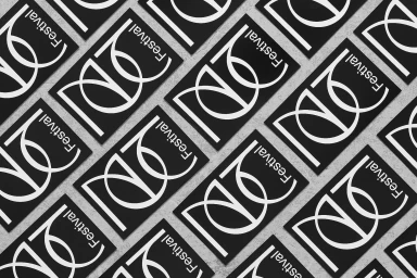
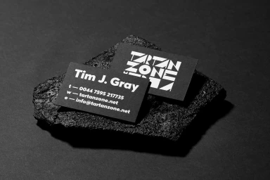
The brand identity for Soft skincare represents a masterclass in visual restraint, expertly blending the clinical precision of modern corporate branding with a warm, human-centric approach to beauty. Through a sophisticated interplay of textures and light, the campaign creates an atmosphere of accessible luxury, utilizing natural light and high-key beauty light techniques to emphasize both product efficacy and a gentle, skin-first philosophy. The creative execution leans into a minimalist aesthetic, pairing clean, retro-inflected typography with bold, monochromatic color palettes that elevate everyday skincare essentials into elevated design objects. Across the various compositions, the project balances the tactile nature of print collateral—such as embossed business cards and high-contrast stationery—with the soft, organic forms found in their packaging and lifestyle photography. By grounding the brand in consistent, high-contrast layouts and sharp, geometric compositions, the creative team has established a visual language that feels both authoritative and approachable. This project demonstrates an acute understanding of how to translate abstract brand values into a tangible, cohesive narrative, proving that effective skincare branding relies as much on the thoughtful curation of space, shadow, and material as it does on the products themselves. Whether through close-up macro photography or strictly ordered graphic layouts, every element works in harmony to reinforce a clean, premium identity that resonates with contemporary consumers seeking simplicity and intentional design.
Horizontal, Commercial, Clean
Advertising Campaign


