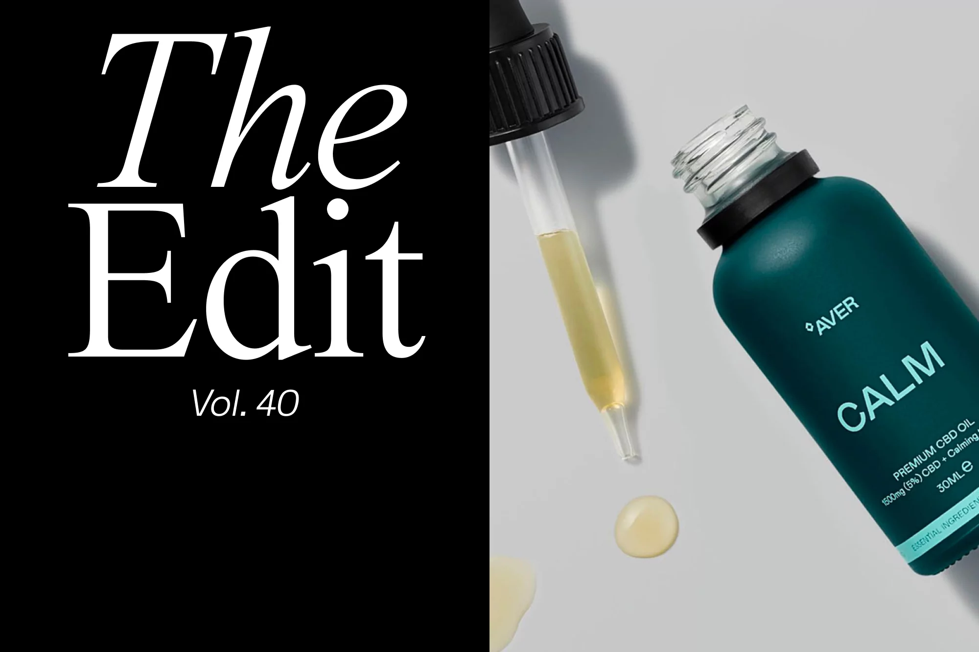
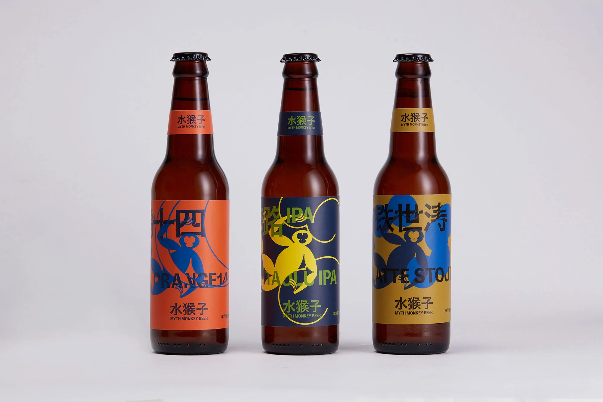
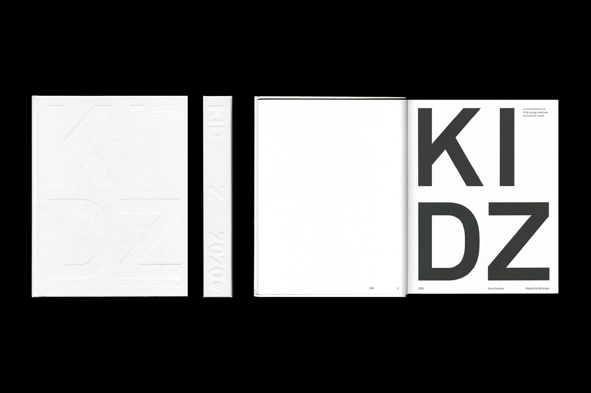
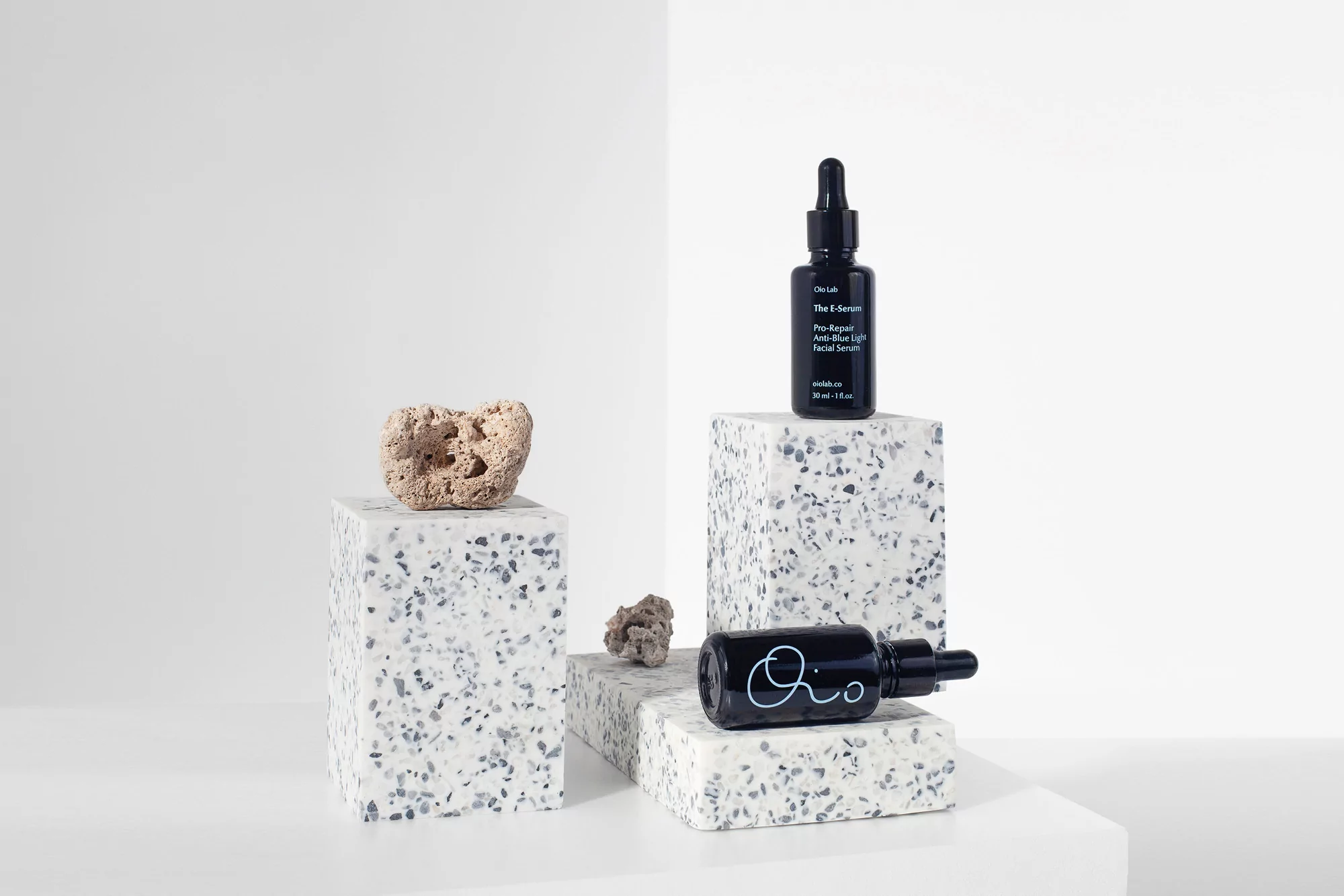
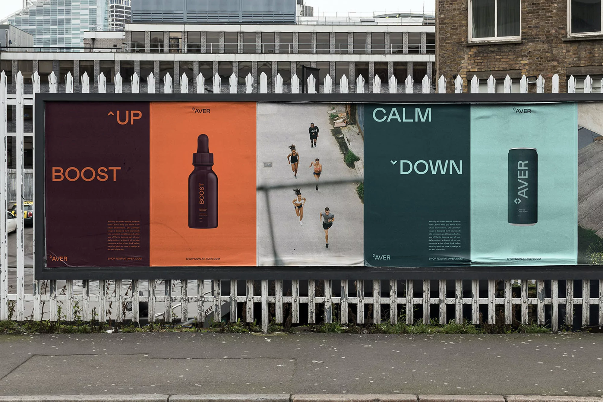
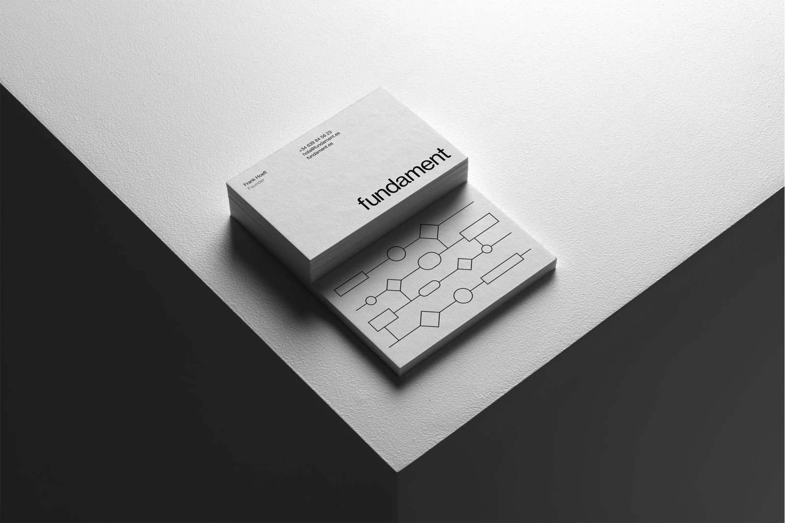
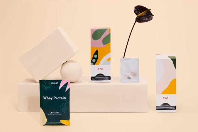
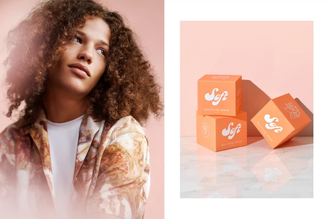
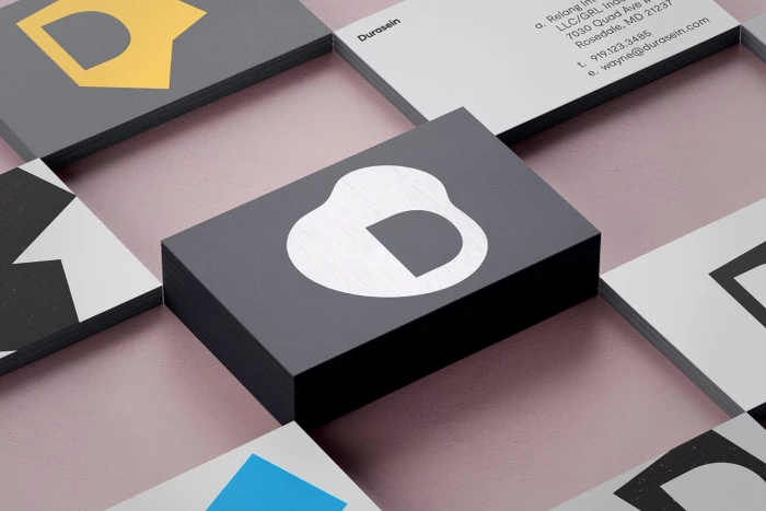
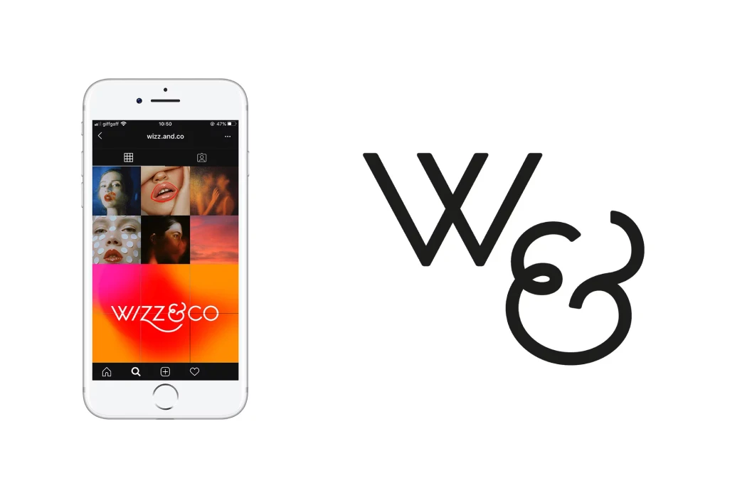
The brand identity for Aver reflects a sophisticated mastery of minimalist aesthetics, blending the boundaries between wellness and high-end consumer goods. This multi-faceted project, curated by a diverse collective including Point Studio, Barns Furr, Fire Work, Hugmun, Re, Union, Meat Studio, and Elke Scholiers, establishes a visual language defined by editorial precision and architectural geometry. Across diverse applications—from sleek CBD oil packaging using beauty light to vibrant, illustration-forward beverage labels—the work maintains a consistent, premium sensibility. The team leans into a clean, modern palette where high-contrast typography and thoughtful negative space transform everyday commercial products into pieces of functional art. Techniques such as emboss and deboss applications on print materials provide tactile depth, while cinematic natural light photography grounds the digital identity in a tangible, organic reality. Whether seen in the interplay of matte textures against terrazzo platforms or the expansive scale of urban billboard advertising, the brand identity channels a sense of deliberate, refined clarity. By integrating rigorous sans-serif typography with high-key lighting and structured layouts, the project transcends simple product promotion, instead crafting an cohesive corporate identity that feels both established and daringly contemporary. It is a comprehensive study in balance, where technical precision in graphic design and thoughtful composition define a brand that is as much about atmosphere as it is about utility.