
Hungry Worms: Brand Identity
Sep 2020
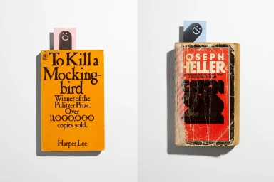
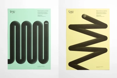
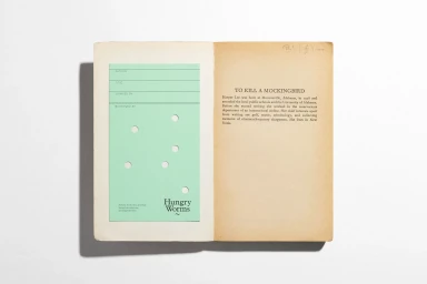
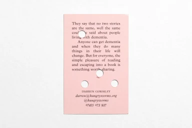
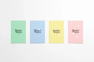
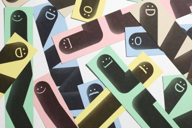
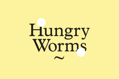
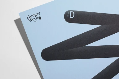
The brand identity for Hungry Worms is a masterful exercise in minimalist graphic design, blending nostalgic literary charm with a contemporary, playful visual language. Crafted with the expert input of DutchScot for creative direction and execution, the project reimagines the traditional reading experience through a sophisticated, tactile lens. The identity utilizes a refined pastel color palette—mint green, soft pink, pale yellow, and baby blue—to anchor its commercial aesthetic, while integrating vector-based illustrations of whimsical, emoticon-adorned worms that snake across various surfaces. By pairing clean serif typography with intentional negative space, the design achieves a balance between structured professionalism and imaginative warmth. A key narrative element is the physical interaction with the brand, evidenced by the use of die-cut holes and embossed details on high-quality paper stock, a testament to the precision printing provided by Gavin Martin Colournet. Whether through vintage paperback bookmarks, library-style checkout cards, or abstract promotional strips, the identity succeeds in inviting audiences to send a book on a journey. The project relies on bright, even lighting and high-contrast, hard-light photography to highlight the matte textures and architectural precision of the die-cut elements. This cohesive brand identity serves as a standout example of how minimalism can be used to tell a story that feels both intellectually grounded and inherently approachable.
Horizontal, Clean, Commercial, Minimalist
Typography
White Seamless
Advertising Campaign

