
Littlemore: Brand Identity

Apr 2021
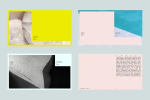
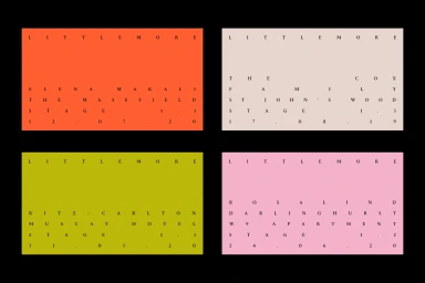
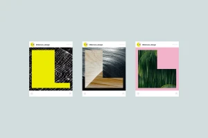
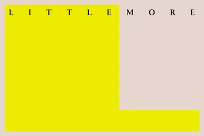
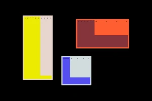
DutchScot developed the brand identity for Littlemore, crafting a visual system defined by its minimalist aesthetic and geometric precision. The project encompasses a comprehensive suite of assets, ranging from stationery and social media mockups to tactile merchandise, all unified by a consistent use of bold color blocking and widely spaced serif typography. Techniques such as vector-based graphic design and clean typography are central to the identity, which balances vibrant color palettes with neutral negative space. The execution relies on a structured grid to maintain clarity, whether applied to digital interfaces or printed applications like natural canvas totes. This modern approach to branding emphasizes high-contrast layouts and geometric forms to establish a clear visual language.
Horizontal, Minimalist, Commercial
Typography
