
Slam Jam
Brand Identity
Nov 2017
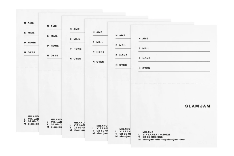
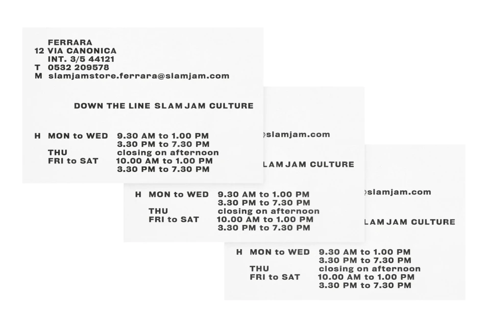
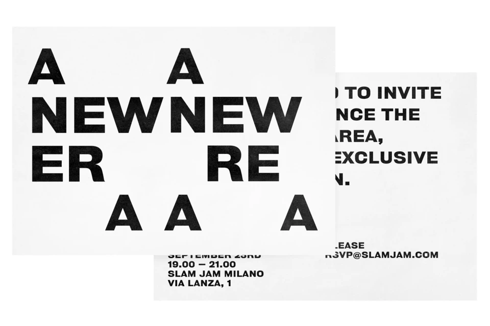
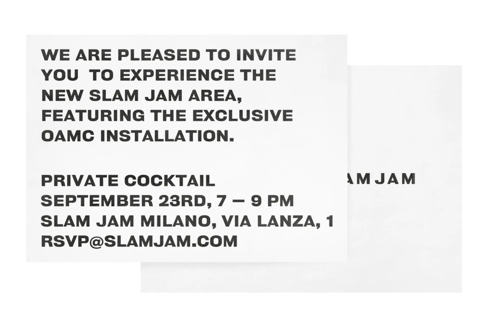
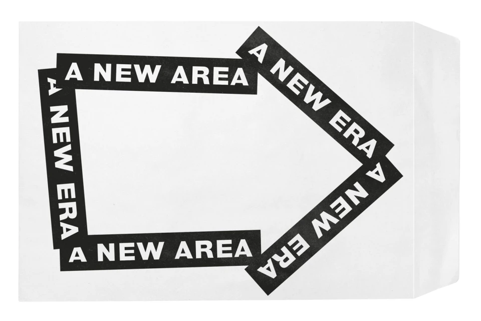
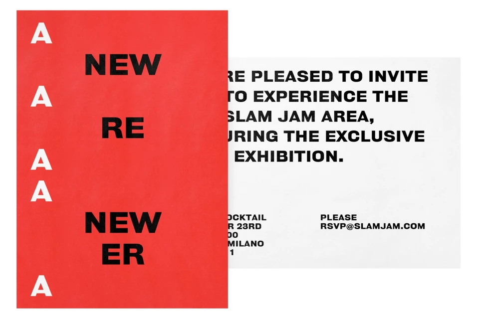
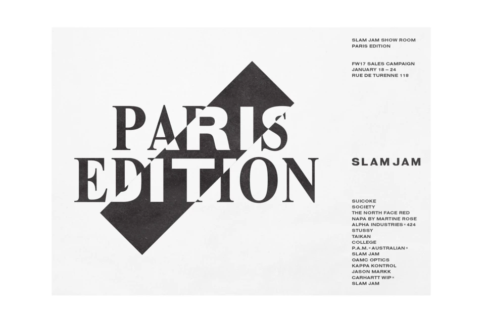
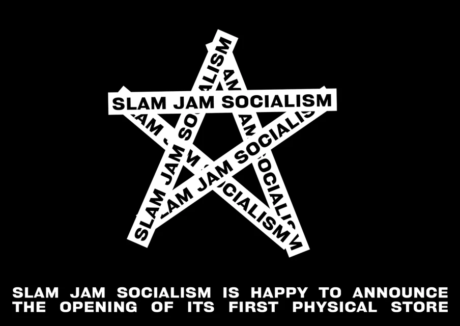
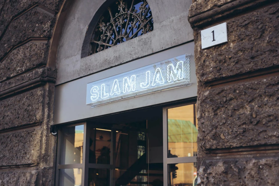
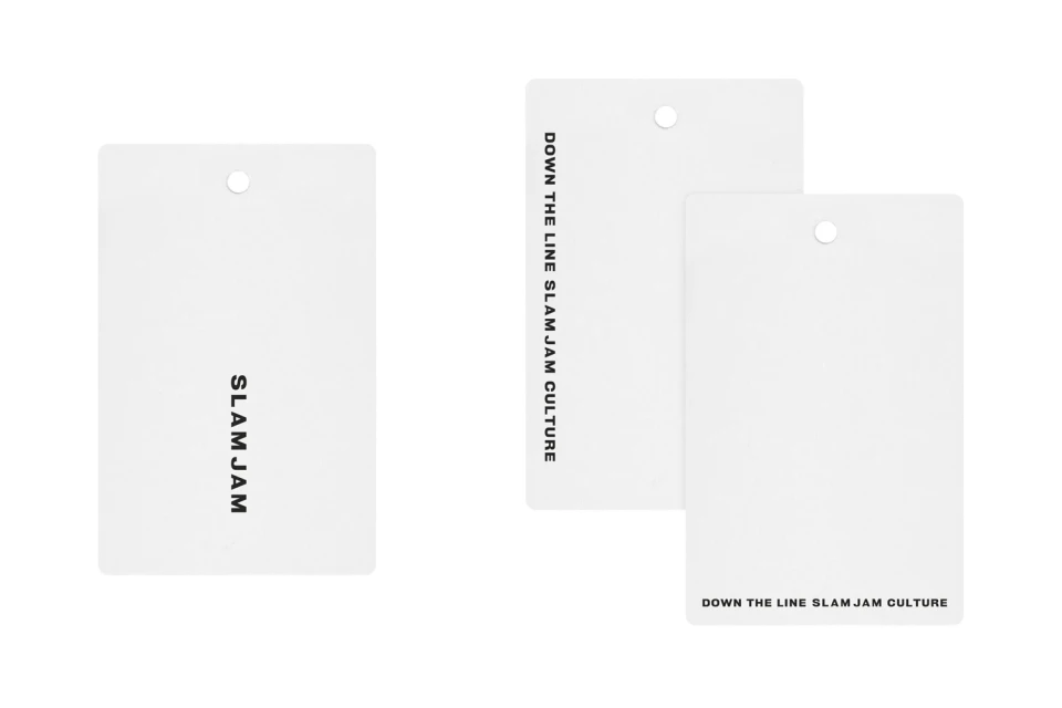
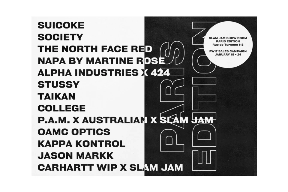
The evolution of the Slam Jam brand identity represents a masterclass in streetwear and fashion communication, demonstrating how rigorous graphic design can anchor a global retail presence. Developed in collaboration with Bureau Borsche, this comprehensive project identity system eschews conventional fluff in favor of a stark, utilitarian aesthetic that feels both institutional and inherently modern. The work relies heavily on high-contrast black and white palettes, utilizing bold, sans-serif typography as the primary driver for visual hierarchy across every touchpoint. From corporate event invitations and sales campaign collateral for the Paris Edition FW17 to the physical retail signage in Milan, the design language leans into a minimalist, architectural logic. Each piece—whether a simple hang tag, an adhesive graphic installation, or a formal business form—is treated with the same geometric precision, leveraging heavy negative space to ensure maximum legibility and brand impact. The synthesis of these assets reveals a cohesive, corporate-facing visual strategy that feels distinctly elevated, particularly when juxtaposed against the raw, rustic stone textures of their physical storefronts. By stripping away extraneous ornament, the project establishes a robust, highly modular brand framework that prioritizes functional clarity, effectively positioning Slam Jam not merely as a retailer, but as a central authority within the contemporary global fashion landscape.
Horizontal, Commercial, Clean
Typography
Streetwear
White Seamless
Advertising Campaign
