
The Face
Brand Identity



Oct 2019
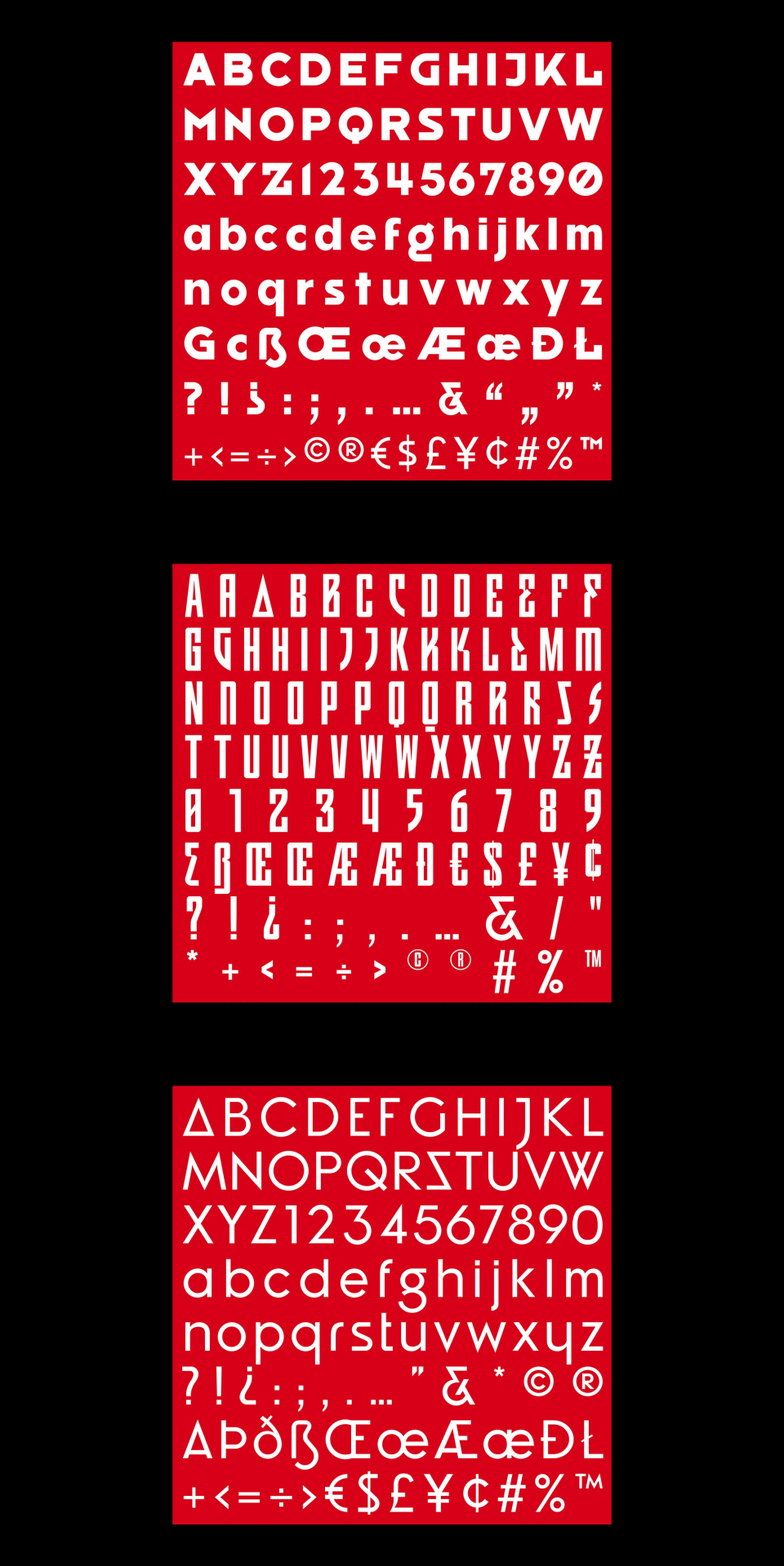
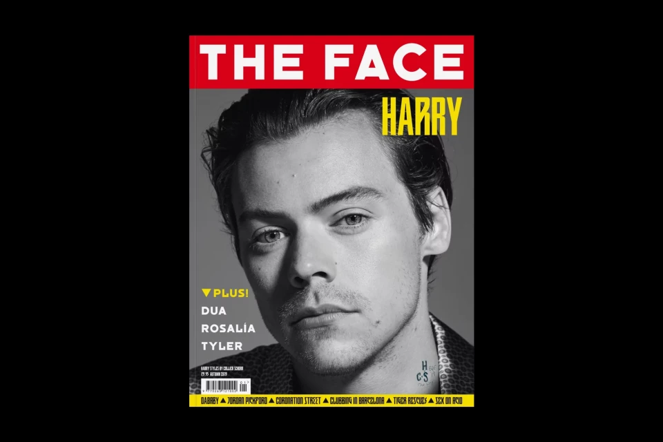
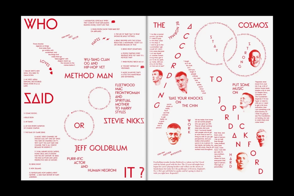
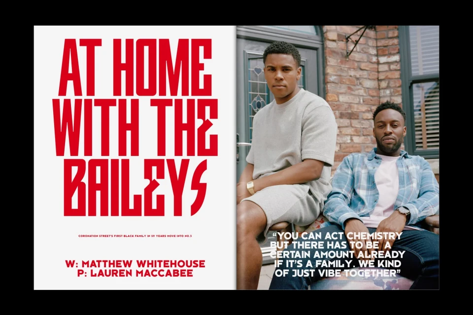
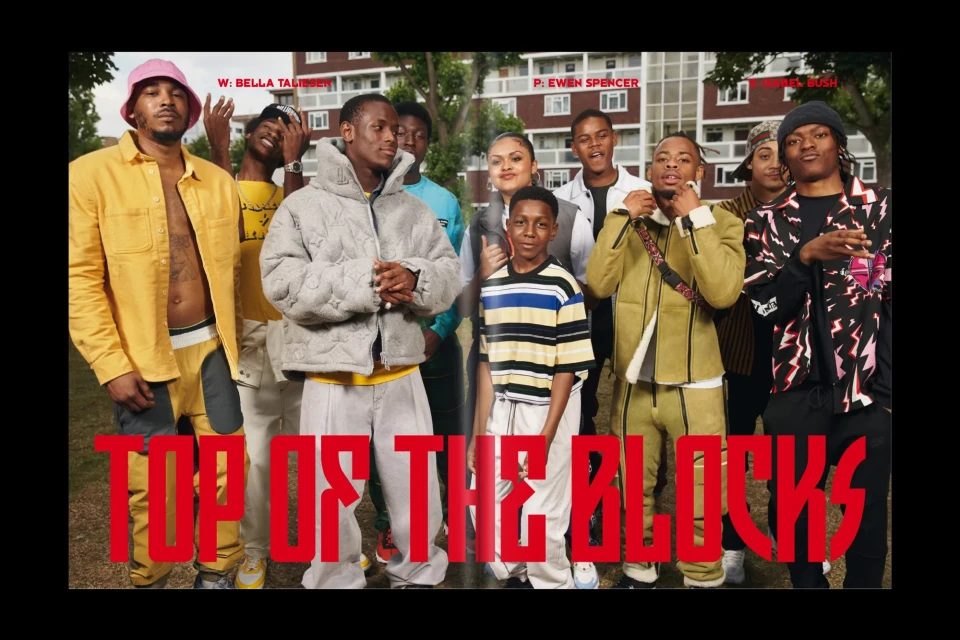
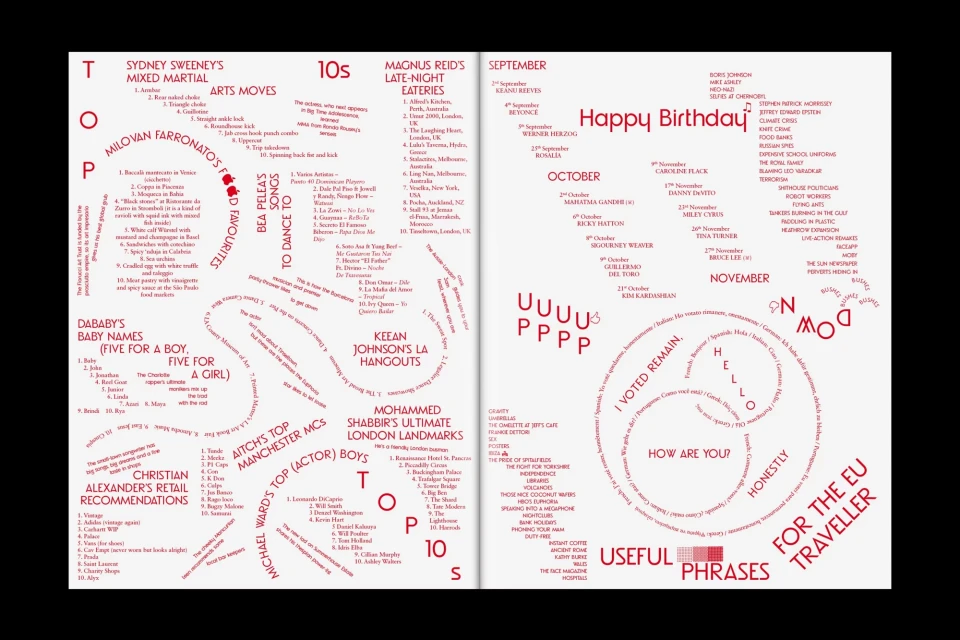
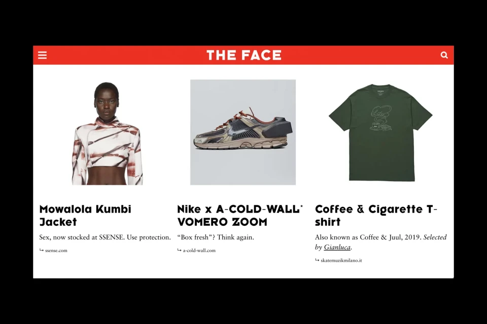
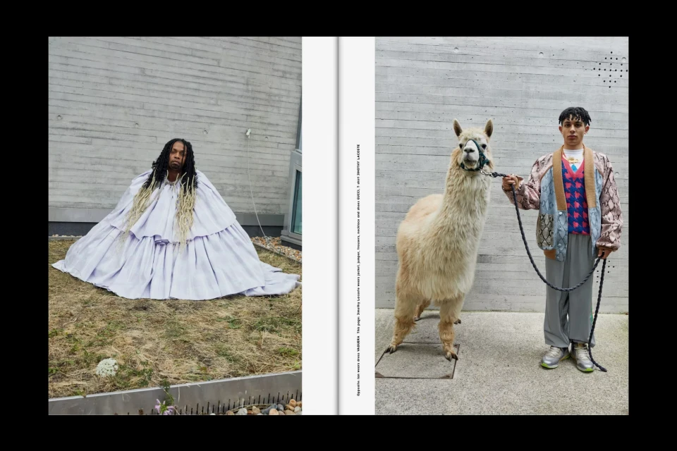
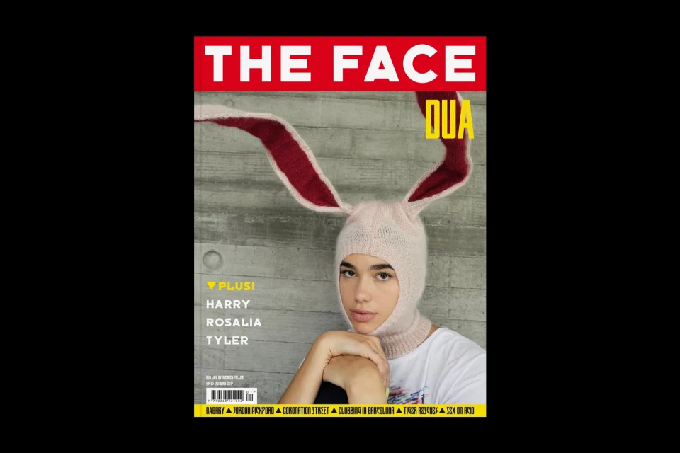
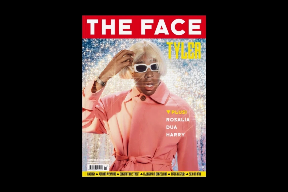
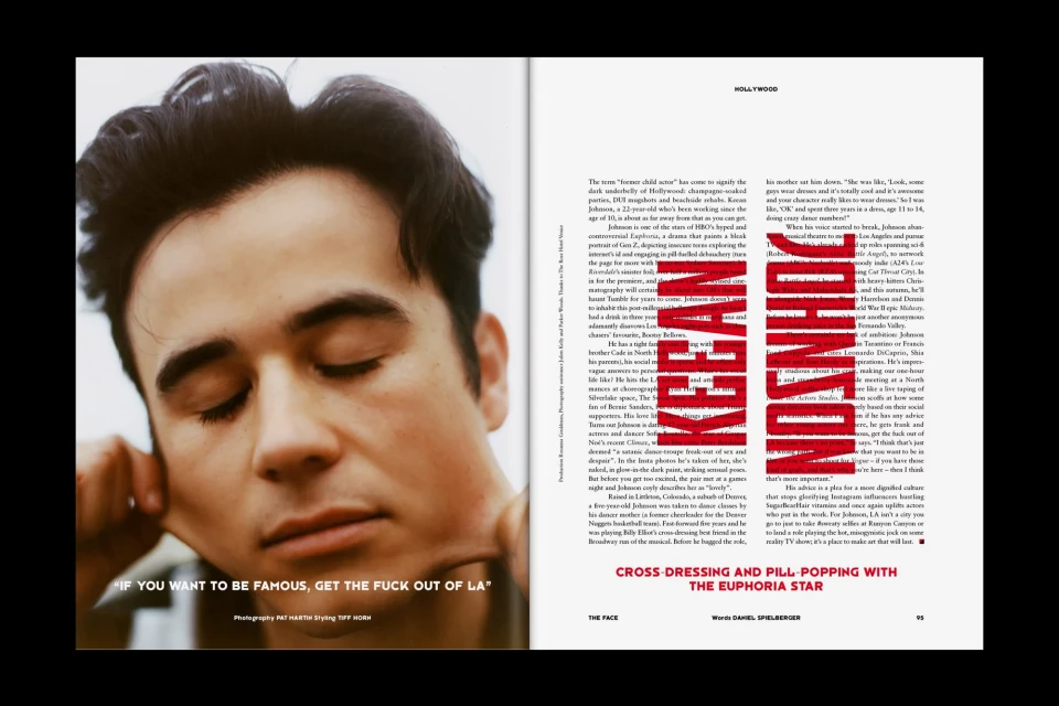
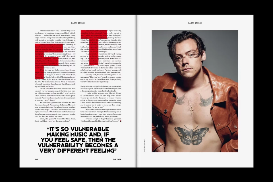
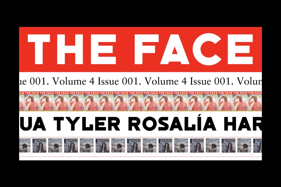
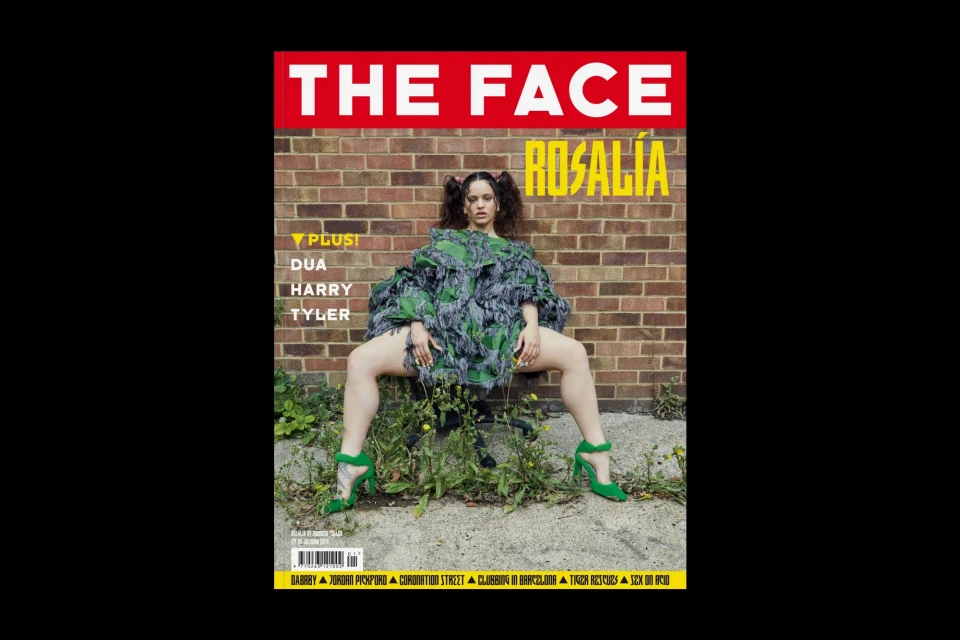
The Face magazine has long been a cultural bellwether, and its recent brand identity overhaul cements its status as a pinnacle of contemporary media and entertainment design. This expansive visual system leans into a high-contrast, minimalist aesthetic that feels both urgent and timeless. At the core of the project is a relentless commitment to editorial strength, characterized by a striking color palette of vibrant red, sterile white, and bold black-and-white. Under the art direction of Bureau Borsche, the publication masterfully integrates typography as a structural force rather than mere decoration. By employing rigid grid systems, rhythmic character repetition, and modular letterform development, the design team creates a clean, authoritative visual language that anchors the magazine’s eclectic content. Whether framing candid editorial photography of cultural icons like Harry Styles and Dua Lipa or organizing complex lifestyle journalism through cinematic, low-key lighting, the work balances spontaneity with precise graphic execution. The project utilizes techniques like duotone portraiture and negative space to guide the reader through dense editorial layouts, blending traditional print sensibilities with a modern, commercial edge. By eschewing over-embellishment in favor of stark, vector-based typography and deliberate, natural light photography, the branding ensures that every page serves as a cohesive extension of a legacy publication that continues to define the intersection of youth culture, fashion, and sophisticated graphic communication.
Clean, Editorial, Horizontal
Typography
Magazines
Editorial
