
Carhartt WIP
Brand Identity
Oct 2017
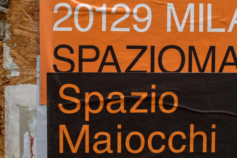
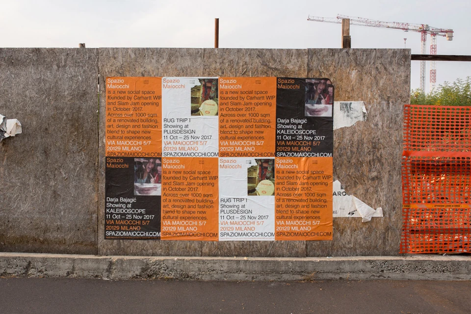
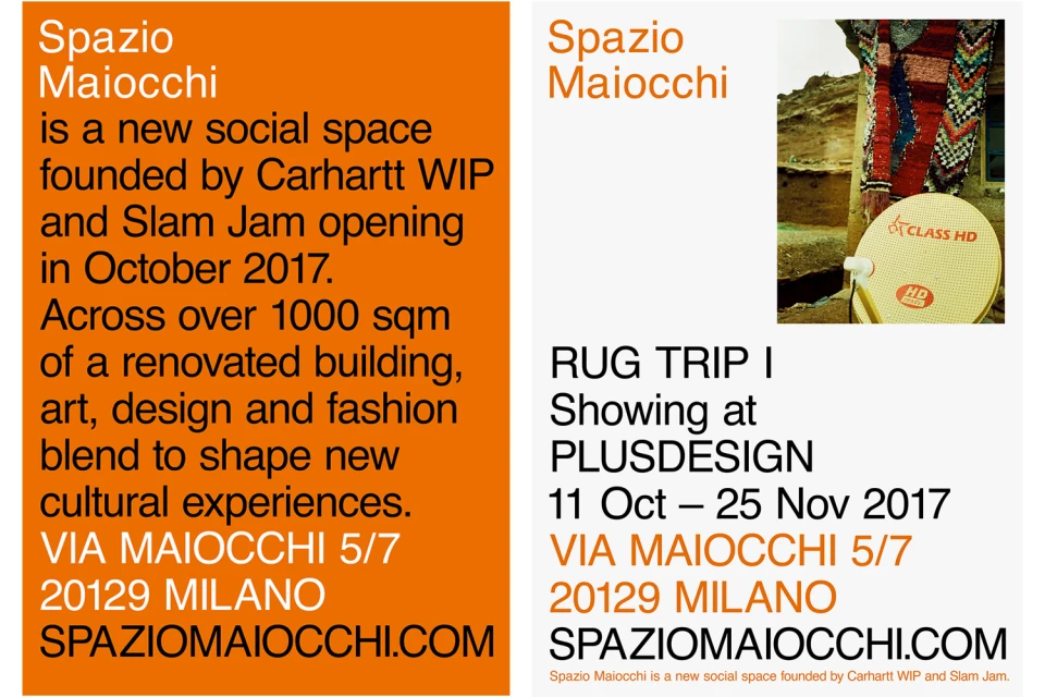
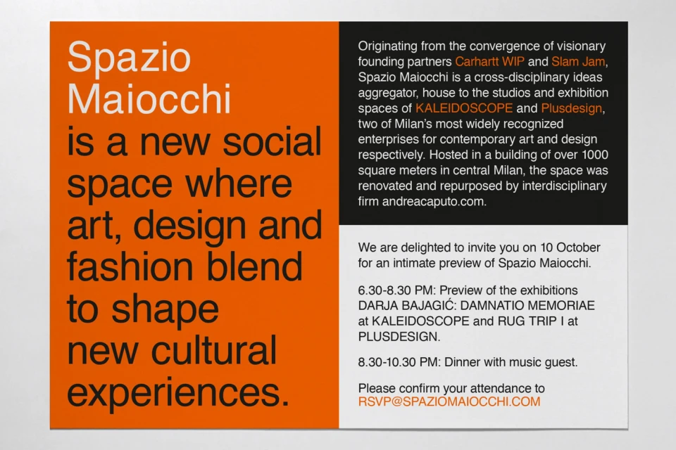
The brand identity for Spazio Maiocchi, a cultural hub established through the collaborative efforts of Carhartt WIP and Slam Jam, manifests as a masterclass in editorial minimalism and geometric precision. Developed with graphic design oversight by Bureau Borsche, the visual system leans into a highly disciplined design language that prioritizes clarity and high-contrast impact. By utilizing a core palette of stark black, crisp white, and a signature vibrant orange, the project anchors its aesthetic in a bold, sans-serif typography that feels both industrial and refined. The identity seamlessly translates across various applications, from strictly controlled corporate vector graphics and invitation cards to the raw, textured environments of urban poster sites. Whether presented on digital collateral or weathered particle board surfaces in Milan, the work maintains a rigorous, symmetrical consistency. The project expertly utilizes typography as a structural element, creating a modern, professional framework that highlights information hierarchy while embracing the gritty, utilitarian backdrop of its physical space. Through this graphic approach, the brand identity effectively captures the duality of Spazio Maiocchi as both a professional corporate institution and a vibrant, evolving site for cultural intersection and exhibition-based programming, ensuring that every touchpoint reinforces a cohesive and recognizable identity within the contemporary streetwear and art landscape.
Commercial, Square, Clean, Minimalist
Typography, Vector
White Seamless
Advertising Campaign
