
RIMOWA
Brand Identity
Jan 2018
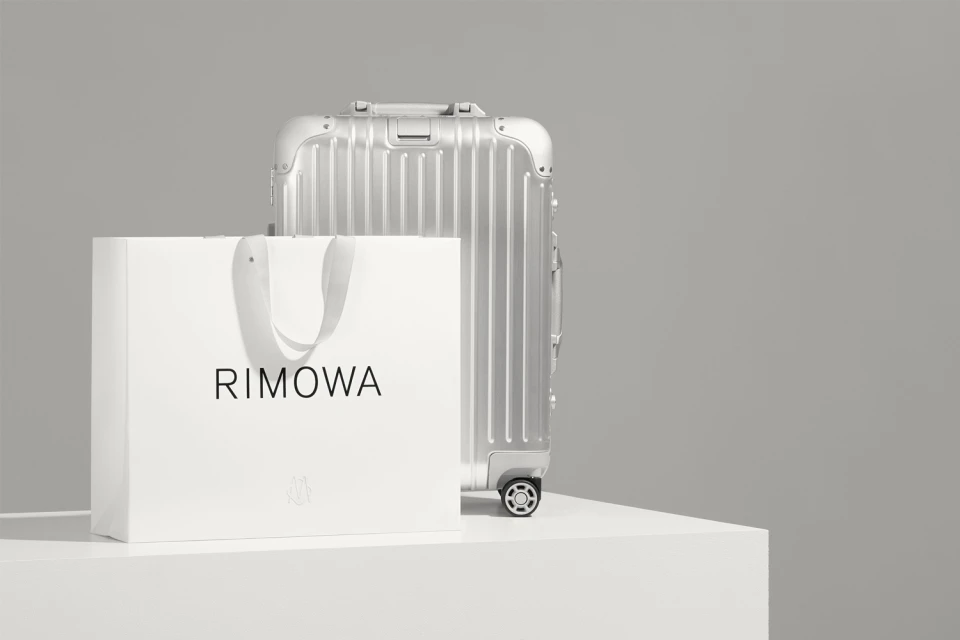
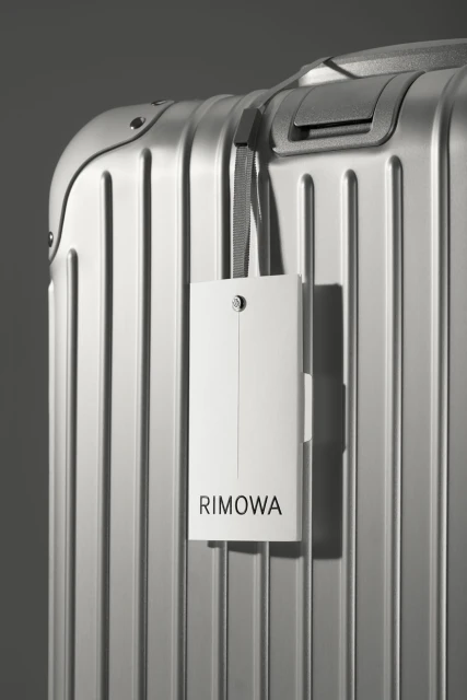
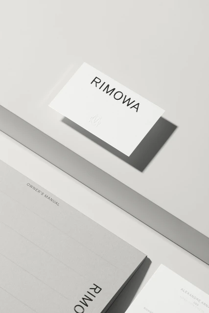
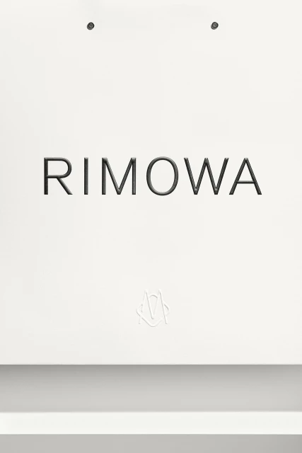
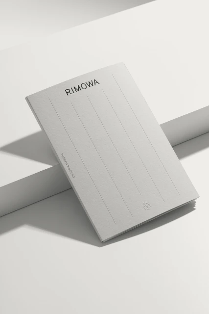
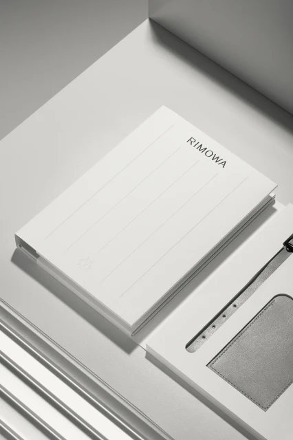
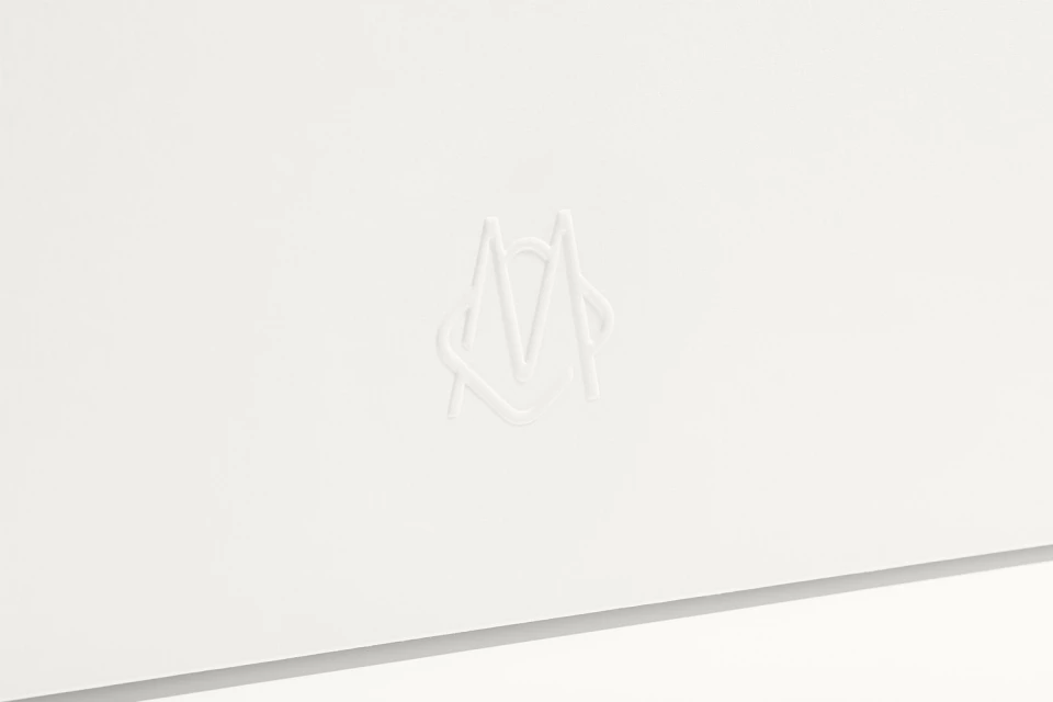
The latest brand identity project for RIMOWA serves as a masterclass in luxury minimalism, stripping away the superfluous to reveal the architectural soul of the luggage icon. Executed with the sophisticated precision of Bureau Borsche, this visual campaign leans into a strictly curated palette of high-key whites, light greys, and metallic textures. The imagery relies heavily on the deliberate use of studio strobe lighting, which cuts across the iconic grooved aluminium surfaces to emphasize geometric depth and tactile refinement. By focusing on the interplay between embossed monograms, crisp sans-serif typography, and the industrial materiality of the suitcase handles, the project channels a sense of elevated order that is quintessentially Rimowa. Each frame operates as a study in commercial restraint, favoring a clean, symmetrical composition that elevates everyday collateral—such as owner manuals, shopping bags, and branded stationery—into objects of desire. This approach perfectly aligns with the bags and accessories industry, where the brand’s identity is synonymous with durability and design-forward engineering. The result is a highly controlled, professional aesthetic that feels both modern and timeless. Through this lens, the brand identity does more than present products; it communicates a commitment to precision and understated luxury, ensuring that every touchpoint reflects the brand's heritage of high-end travel performance while maintaining a polished, architectural visual language across all digital and physical assets.
Commercial, Clean, Minimalist, Vertical
Bags & Accessories
Grey Seamless
Advertising Campaign
