
Platform
Brand Identity
Feb 2017
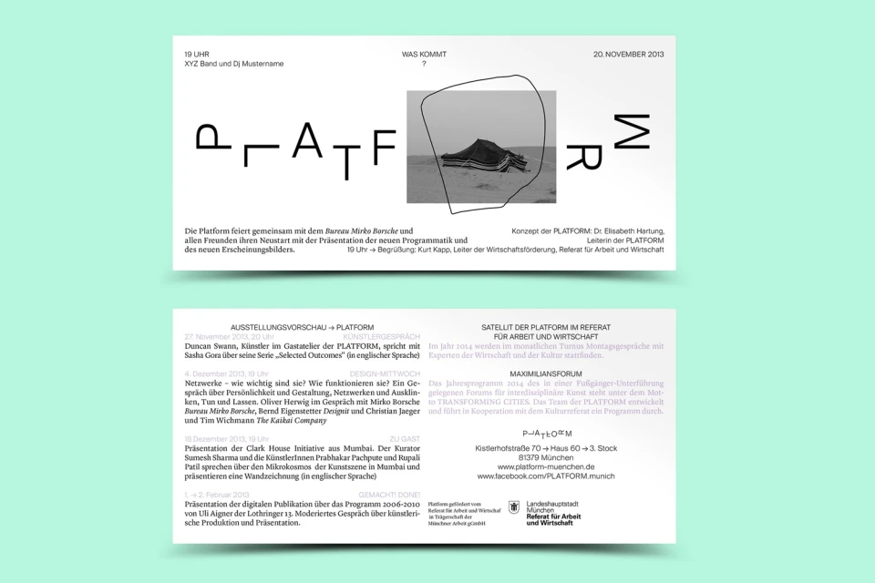
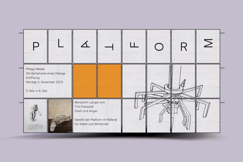
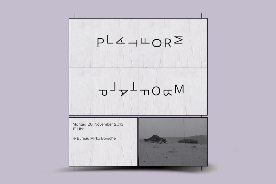
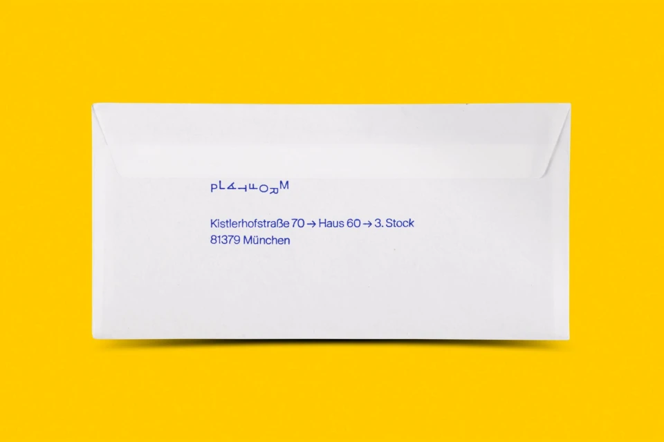
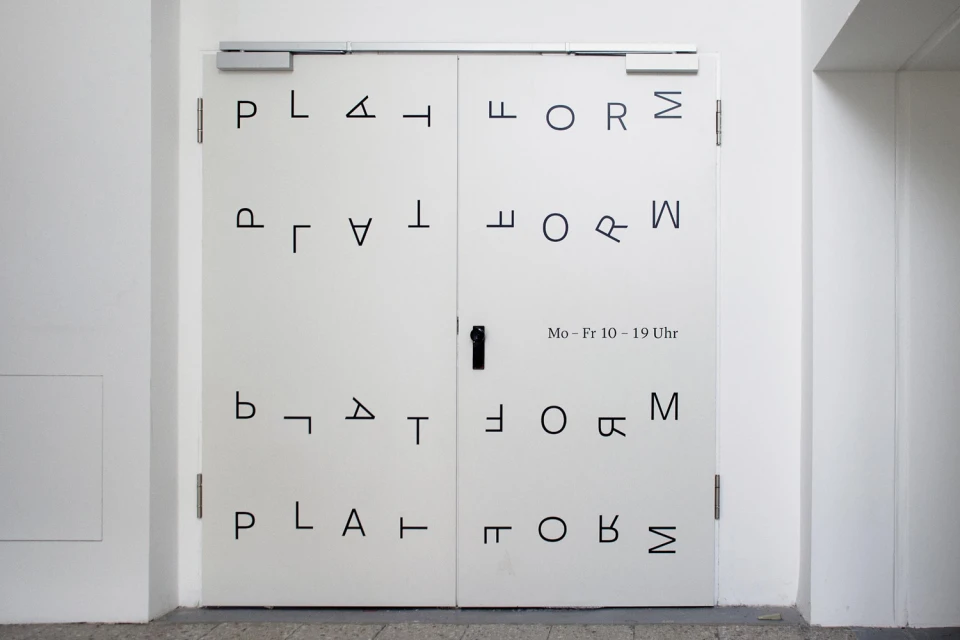
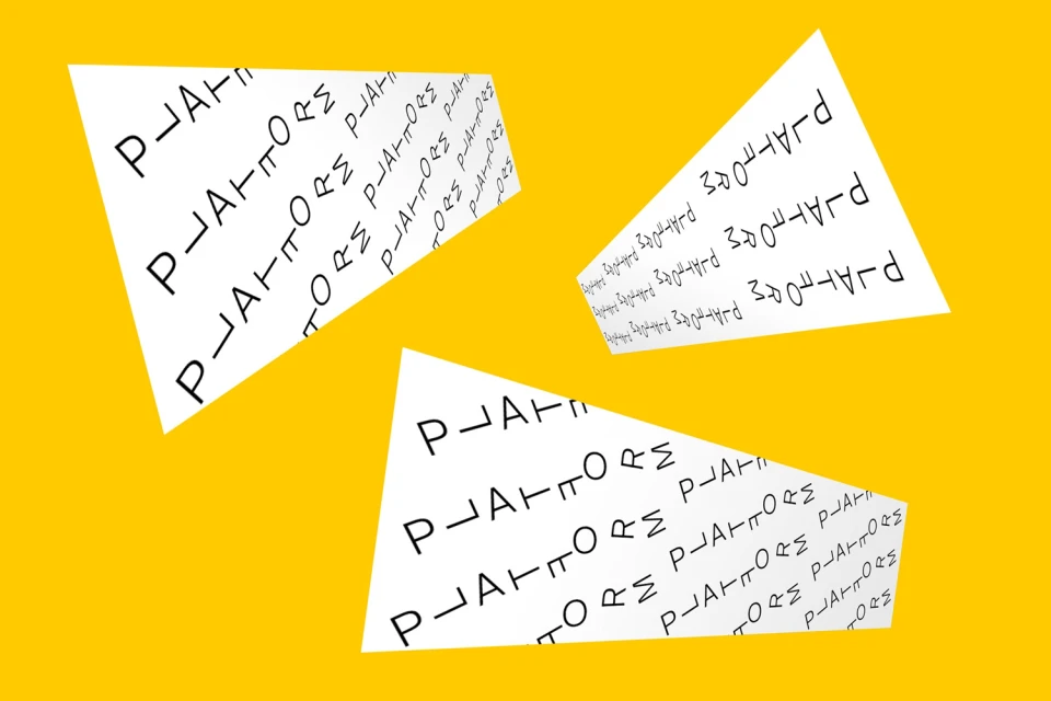
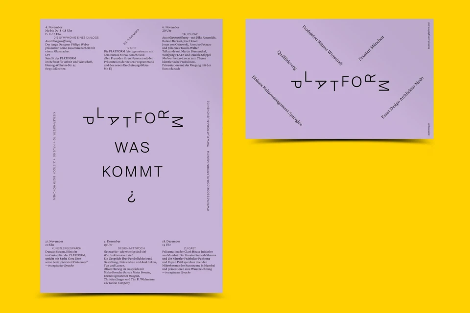
The brand identity for Platform, crafted by the design studio Bureau Borsche, masterfully balances structural rigor with typographic playfulness to define the visual language of the digital media and entertainment organization. Across a series of graphic design assets, the project leans into a highly intentional minimalist aesthetic that prioritizes negative space and a bold, high-contrast color palette of vibrant yellow, soft lavender, and mint green. The identity is anchored by bespoke, stylised sans-serif typography, where characters are frequently rotated, flipped, or spaced wide to challenge traditional reading patterns while maintaining a cohesive grid system. By integrating functional information design with abstract vector elements and pencil-style line drawings, Bureau Borsche creates a versatile visual system that functions equally well on physical signage and standard stationery. The execution utilizes techniques such as studio strobe lighting for product mockups and modular grid layouts to ensure a professional, editorial look suitable for cultural communications. This contemporary approach to corporate identity design avoids clutter, instead relying on geometric precision and clear visual hierarchy to convey information. The resulting work feels both technical and artistic, reflecting an institutional sophistication that translates seamlessly from print posters and double-door signage to digital displays, ensuring Platform maintains a distinct and recognizable presence across all brand touchpoints.
Horizontal, Clean, Minimalist, Graphic
Typography
Solid Colour
Advertising Campaign
