Samson: Brand Identity

Jun 2023
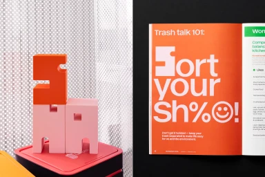
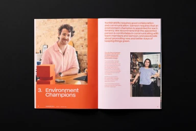
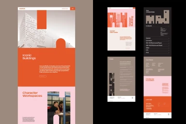
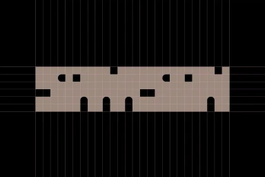
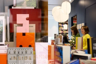
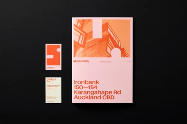
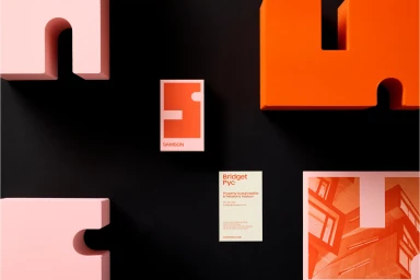
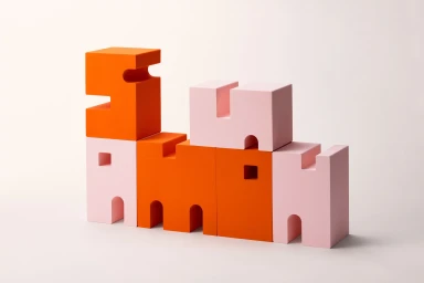
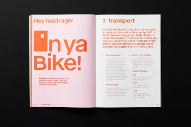
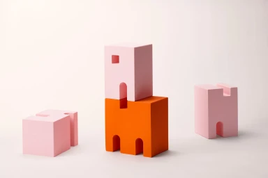
Samson’s brand identity project establishes a cohesive visual language through a blend of editorial design, bespoke typography, and geometric form. The system is defined by a bold color palette of vibrant orange and soft pink, applied across print collateral, digital mockups, and environmental photography. Key collateral includes editorial brochures and magazine spreads that pair structured information with playful graphic treatments and clean column layouts. The identity further utilizes custom sculptural typography blocks to introduce three-dimensional elements into the brand architecture. Photography by Tash Hopkins and Yuki Sato captures the project across various settings, from modern retail environments to controlled studio compositions featuring G.F Smith paper stock. Graphic design lead Seven developed the overarching layout systems, integrating architectural photography and minimal interface elements to ensure a consistent presence across physical and digital media.
Horizontal, Clean, Commercial, Minimalist
Advertising Campaign