
Essie: Brand Identity



Jun 2020
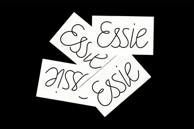
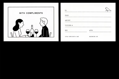
The new brand identity for Essie transcends the typical constraints of the food and beverage industry, leaning into an aesthetic of refined minimalism that prioritizes clarity and sophisticated restraint. Through a thoughtful synthesis of graphic design by Cam Norris and intricate, geometric illustration work by Lennard Kok, the project establishes a cohesive visual language that feels both timeless and contemporary. The identity centers on a high-contrast aesthetic, utilizing a stark black-and-white color palette that anchors the brand in premium territory. From the precision of the white line art icons depicting viticulture to the fluid cursive script applied across tactile paper stocks provided by G . F Smith and Colorplan, every touchpoint is designed for maximum impact. The project effectively utilizes vector design and UI illustration to create an urban, narrative-driven atmosphere, particularly evident in the depiction of bustling cafe storefronts and intimate dining vignettes. By integrating sharp, natural light photography with clean, abstract typography, the brand achieves a level of editorial minimalism that distinguishes it within a crowded marketplace. This cohesive approach to visual storytelling suggests that Essie is not merely a name but a lifestyle, one that values the delicate interplay between form, light, and negative space to communicate its core identity with elegance and purpose.
Horizontal, Minimalist, Monochrome, Artistic, Clean
Advertising Campaign


