
Firsthand Supply: Brand Identity




Jun 2020
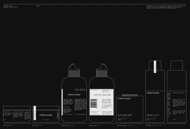
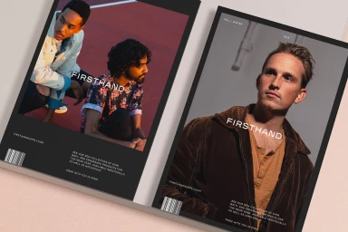
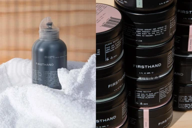
Firsthand Supply creates a striking visual language that bridges the gap between industrial utility and modern grooming, as seen in their latest brand identity project. By leaning into a minimalist and restrained aesthetic, the design system utilizes high-contrast, monochromatic visuals to establish a premium yet accessible market presence. The project excels in its technical precision, featuring clean white line drawings and utilitarian UI illustration that clearly communicate the product functionality and a commitment to sustainable, recycled materials. The editorial spread, characterized by soft light and bold sans-serif typography, elevates the grooming category through a sophisticated blend of high-end corporate style and raw, natural textures. This cohesion extends from the detailed schematic technical illustrations to the physical touchpoints, such as matte black business cards and screen-printed textiles, which emphasize tactile quality. Graphic design contributions by Parker ensure that every element, from the iconic open-hand vector logo to the carefully curated circular ingredient labels, maintains a balanced, geometric rhythm. Executed with technical mastery, the branding utilizes high-quality papers from G. F. Smith and Colorplan, brought to life through precise production by Evolution Press. This body of work reads as a masterclass in modern commercial design, where the focus remains steadfast on clarity, material integrity, and a timeless, industrially-inspired visual identity that resonates across both digital and print platforms.
Horizontal, Commercial, Clean


