
OFFCUTS: Brand Identity
May 2025
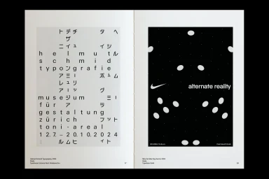
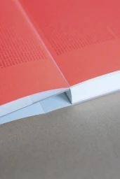
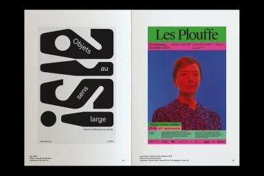
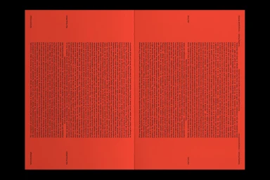
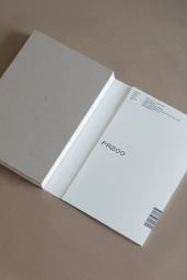
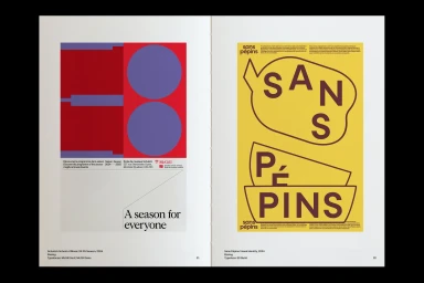
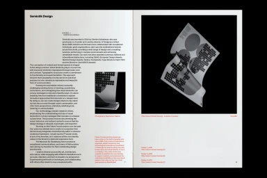
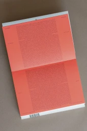
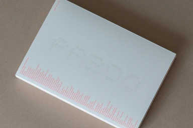
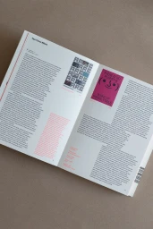
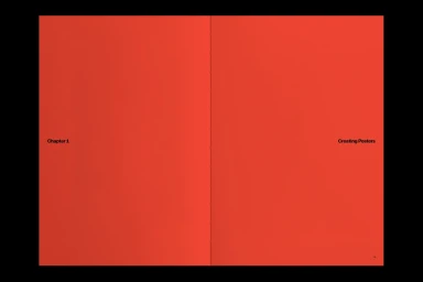
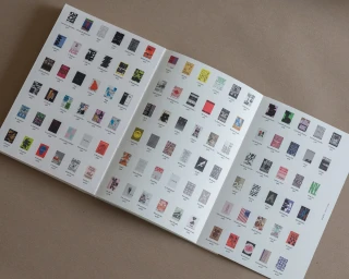
The brand identity for OFFCUTS manifests as a comprehensive publication that explores the intersection of graphic design, typography, and print craftsmanship. Across a series of tactile editorial spreads, the project employs meticulous grid structures and high-contrast color blocking to establish a distinct visual language. Featuring contributions from Frost on typeface design, G . F Smith on paper selection, and Northend on printing, the publication utilizes techniques such as screen print/silkscreen and emboss & deboss to heighten its physical presence. The design relies on a minimalist aesthetic to balance dense columns of text with bold, organic letterforms and structured editorial layouts.
Editorial, Horizontal, Clean
Typography
Editorial


