
FIMI: Brand Identity
Jun 2020
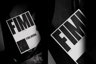
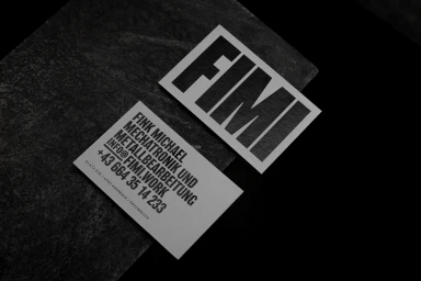
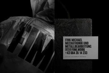
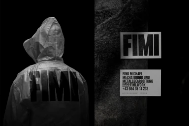
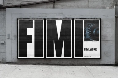
FIMI establishes a formidable presence in the enterprise and B2B software sector with a brand identity that eschews decorative noise for stark, architectural precision. Crafted through the expert graphic design of Lukas Diemling, the visual language leans into a rigorous monochromatic palette, utilizing bold sans-serif typography that feels both industrial and inherently modern. The project employs a low-key chiaroscuro lighting approach to bridge the gap between digital utility and physical presence, placing crisp, high-contrast collateral against weathered concrete and dark, organic slate surfaces to underscore the firm’s mechatronics-focused expertise. By integrating high-quality substrates from Colorplan and G . F Smith, the identity gains a tactile weight that elevates standard business cards and corporate apparel into deliberate statements of professional authority. This commercial project effectively utilizes the raw, gritty textures of its environment to ground the clean, clinical nature of its technology branding. Whether through the bold, minimalist execution of its triptych-style outdoor poster installation or the careful application of emboss and deboss techniques on stationery, the result is a cohesive, symmetrical system that feels built to last. The branding manages to transform the technical nature of metalworking and software services into a sleek, cinematic narrative that prioritizes clarity and formal elegance above all else, ensuring FIMI remains memorable within its complex industrial landscape.
Horizontal, Commercial, Monochrome, Clean
Typography
Advertising Campaign


