
Papperlapapp: Brand Identity

Jun 2024
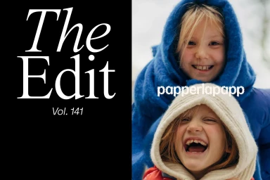
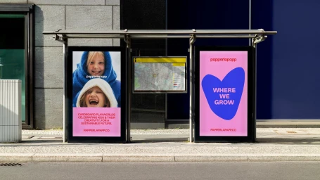
Papperlapapp’s brand identity project establishes a playful visual language through a multifaceted rollout that spans digital interfaces, packaging, and environmental design. The work balances clean, minimalist layouts with experimental type design and motion graphics, utilising a bold palette of block colours to define the brand’s presence. Across several iterations, the identity incorporates kinetic typography and fluid motion graphics to reinforce its focus on sustainable creativity. The collateral features contributions from RAWTY, Hugmun, NotOnSunday, and Mast, who led the graphic design, with NM Type overseeing the type design. From editorial-style photography of children to tactile product packaging featuring amber glass and custom typography, the project maintains a consistent aesthetic that transitions between commercial applications and artistic brand expression.
Horizontal, Commercial, Clean


