
On the Edge: Brand Identity


Brand
Date
Jan 2022
Description
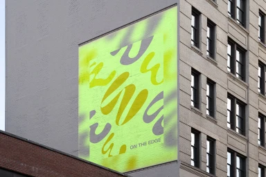
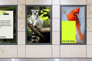
How&How developed the brand identity for On the Edge, an expansive project that integrates bold typography and nature-inspired imagery. The design system features a vibrant palette of yellow, lime green, and grey, applied across environmental murals, large-format posters, and digital motion graphics. The execution relies on a clean, graphic aesthetic that combines editorial layouts with macro cinematography of wildlife and human features. Techniques such as motion graphics and UI illustration enhance the brand's visual rhythm, while a minimalist approach to white space and sans-serif letterforms ensures consistency across both physical and digital touchpoints.
Style
Commercial, Clean, Horizontal
Techniques
Typography
Context
Brand Film / Corporate Video
Associated creatives

5000+ creatives to discover
Sign up to gain access to the entire directory. It’s free.
Visie is a curated library of creative professionals.