
unknown: Brand Identity
Jul 2020
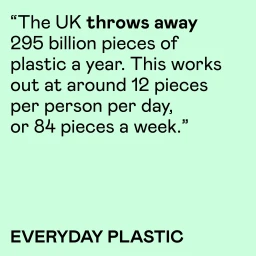
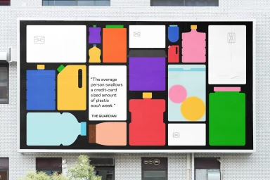
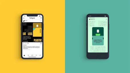
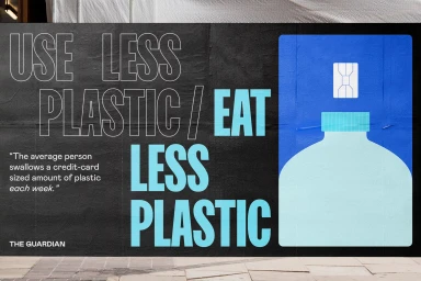
In a crowded media landscape, the challenge of translating dense environmental data into immediate, visceral impact is a feat of creative restraint. This comprehensive brand identity project for the non-profit sector leverages bold typography and a stark, high-contrast aesthetic to translate alarming statistics into an urgent public awareness campaign. Through the clever application of infographics and UI illustration, the project transforms abstract figures—such as the staggering 295 billion pieces of plastic discarded annually in the United Kingdom—into highly legible, digestible visual narratives. The execution leans into a minimalist graphic design language that feels both authoritative and approachable, effectively bridging the gap between rigorous research and populist communication. By utilizing a vibrant, primary color palette against deep black backgrounds, the work demands attention in public spaces while maintaining visual consistency across digital social interfaces and large-scale outdoor billboards. Whether detailing the ingestion of microplastics or highlighting the scale of national waste, the creative direction provided by the design studio How&How ensures that the brand remains the focal point of the discourse. This project proves that successful advocacy design does not require complex flourishes; instead, it thrives on the power of clean composition and the deliberate, strategic use of negative space to drive home a message that is as uncomfortable as it is necessary.
Commercial, Horizontal, Graphic
Typography, Vector
