
One Green Bean: Brand Identity

May 2021
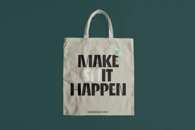
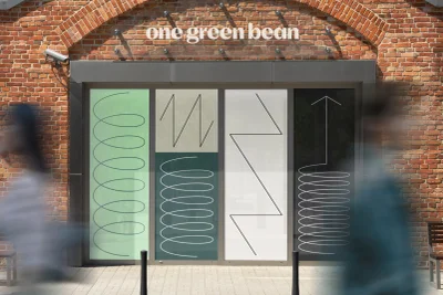
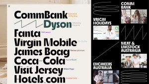
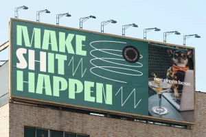
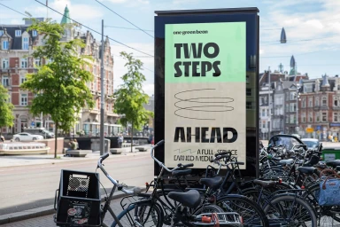
The brand identity for One Green Bean, developed by How&How, utilizes a clean and minimalist aesthetic to establish a modern visual language. The project incorporates high-contrast monochrome layouts and sophisticated typography to create a cohesive system across digital, print, and physical environments. Execution spans a variety of formats, from stationery and hardcover book design to large-scale outdoor billboards and animated motion graphics. The design leans into geometric line art and structured grids, balanced by a distinct palette of mint green, cream, and black. Whether through static graphic design or integrated animation, the identity maintains a consistent, minimalist approach to corporate branding.
Horizontal, Commercial, Clean
Typography
