
How&How: Brand Identity
Jun 2021
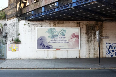
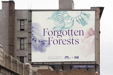
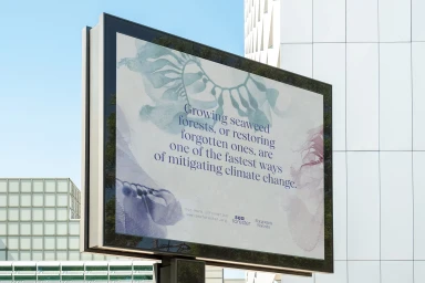
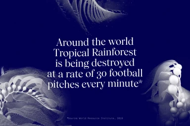
How&How developed a comprehensive brand identity for Forgotten Forests, a project focused on environmental conservation and seaweed forest restoration. The design system leverages typography and botanical illustration to communicate complex ecological messages across both digital and physical touchpoints. The project features a clean, minimalist aesthetic that transitions across outdoor billboards and digital display screens. By utilizing serif typography paired with muted palettes of teal, purple, and blue, the branding creates a distinct visual language. The application incorporates motion graphics and graphic design to highlight the urgent narrative surrounding climate change mitigation.
Horizontal, Commercial, Clean
Out of Home (OOH)
