
Mexicue: Brand Identity
Jun 2018
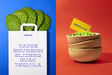
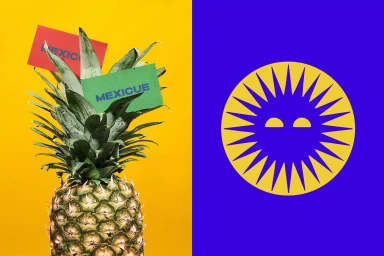
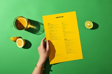
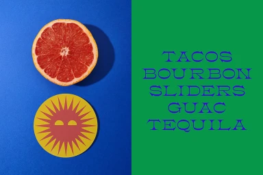
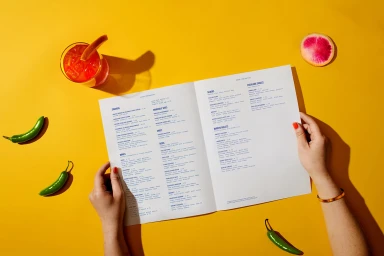
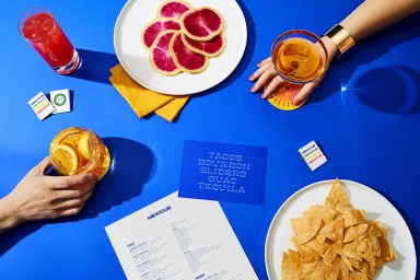
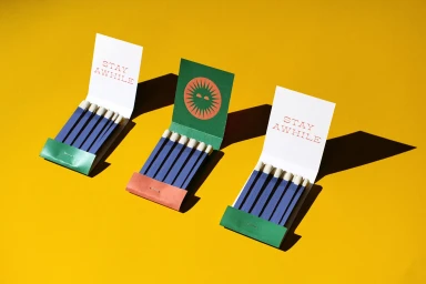
The brand identity for Mexicue, crafted by the design team at High Tide, masterfully balances the vibrant energy of a modern restaurant with a clean, graphic sensibility. Through a series of commercial applications, the visual identity leans into a bold, high-contrast color palette, where saturated royal blues, bright yellows, and fresh greens create a punchy, memorable aesthetic. The project utilizes a minimalist approach to typography and vector assets to ensure the brand remains legible and professional while maintaining a playful, inviting edge. Central to the execution is a clever use of negative space and direct, natural light, which anchors the various flat-lay compositions and editorial elements. Whether featuring a printed menu, custom matchbooks, or stylized product photography, the work relies on intentional object placement to establish a clear visual hierarchy. By incorporating subtle, warm details like sharp, defined shadows and earth-toned ceramics, the identity avoids feeling overly clinical, instead evoking a sunny, lively atmosphere that feels distinctly authentic to the food and beverage industry. This comprehensive design system succeeds by treating every element—from the logotype to the cocktail presentation—as an opportunity to reinforce a cohesive, modern, and spirited brand personality that is as functional as it is visually striking.
Horizontal, Commercial, Clean, Graphic
Typography
Solid Colour
Advertising Campaign
