
Grado: Brand Identity




Feb 2019
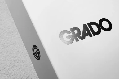
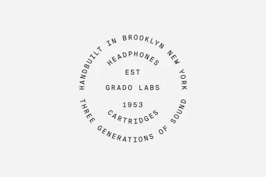
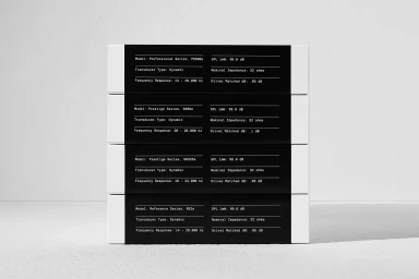
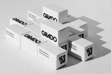
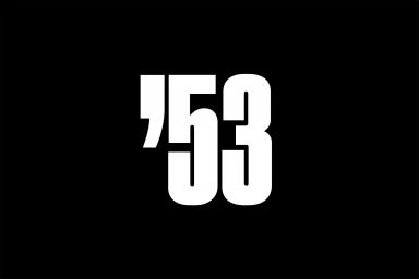
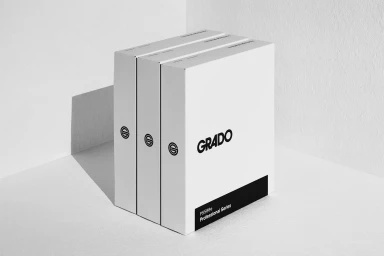
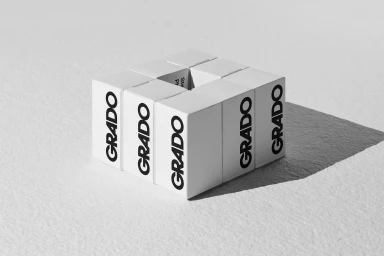
In an era where technology often leans toward the ephemeral, the new brand identity for Grado serves as a masterclass in staying power and restraint. Tasked with refining the visual language of the legendary Brooklyn-based audio manufacturer, High Tide has curated a comprehensive design system that balances heritage with clinical modernism. The execution centers on a striking, high-contrast monochromatic palette, where bold, geometric sans-serif typography anchors the brand against stark black or pristine white backdrops. This approach transcends mere logo application, extending into a cohesive industrial design language across product packaging and digital interfaces. The use of minimalist typography—particularly in the circular iconography that pays homage to the company's 1953 roots—reinforces a sense of heirloom-quality craftsmanship. Throughout the project, the interplay of light and shadow is leveraged through cinematic and hard lighting techniques, transforming humble cardboard packaging into architectural statements. By utilizing macro photography to emphasize tactile details, the campaign highlights the brand's commitment to precision engineering. This identity project successfully bridges the gap between Grado's long-standing audio legacy and a contemporary corporate aesthetic. It is a rigorous exercise in editorial minimalism, ensuring that every touchpoint, from the sleek UI illustrations to the structural product stacks, feels intentionally crafted, highly legible, and undeniably authoritative within the competitive consumer electronics landscape.
Horizontal, Commercial, Clean, Minimalist
White Seamless
