
unknown: Brand Identity
Jan 2020
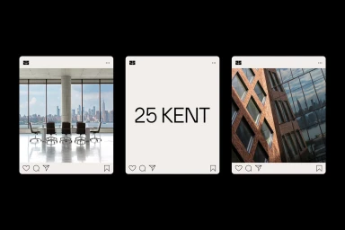
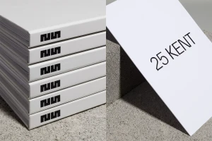
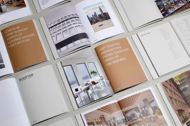
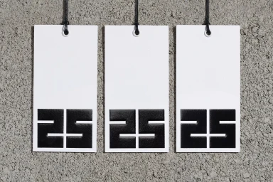
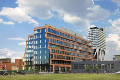
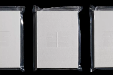
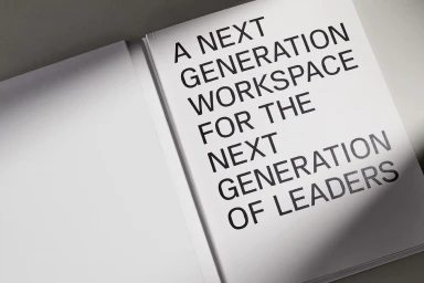
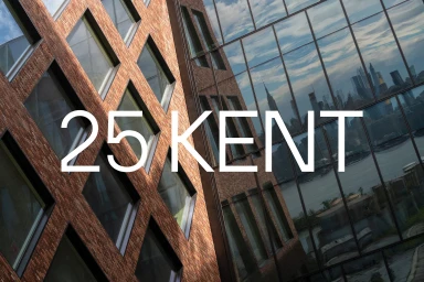
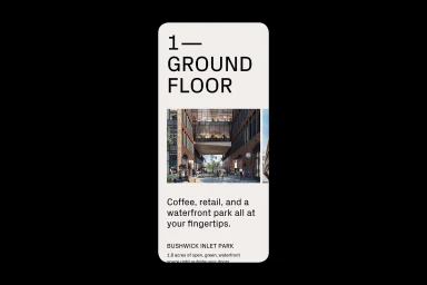
The brand identity for 25 Kent establishes a sophisticated visual language that bridges the gap between industrial heritage and modern corporate utility. Developed with artful precision, the design system leans into a minimalist aesthetic, utilizing a monochromatic palette of white, black, and neutral grey to convey professional clarity. High Tide elevates this corporate identity through a careful balance of materiality, pairing the tactile, raw texture of concrete with the refined, smooth surfaces of high-end print collateral. The project makes extensive use of emboss and deboss techniques, adding a subtle dimension to the typography that resonates with the geometric rigor of the architectural forms. Through a series of carefully composed triptychs and flat lays, the brand identity integrates interior architecture photography with bold, sans-serif typography, creating a cohesive narrative that positions the workspace as a destination for the next generation of leadership. Whether manifesting in vacuum-sealed hardbound books or sleek digital interface cards, the work maintains a clinical, orderly focus. By blending natural light with high-contrast graphic design, the execution achieves a timeless quality, ensuring that the 25 Kent identity remains both impactful and functional within the competitive landscape of commercial office space. This comprehensive project stands as a testament to the power of clean layout design and thoughtful architectural storytelling in shaping a distinct, premium corporate presence.
Horizontal, Commercial, Clean, Minimalist
Typography
