
Resy: Brand Identity


May 2019
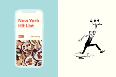
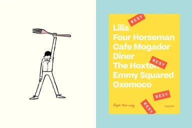
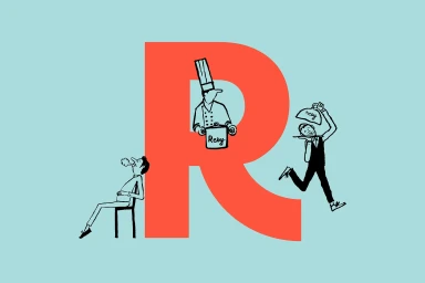
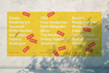
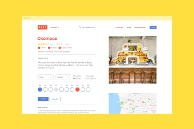
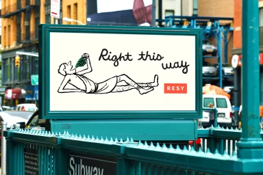
Resy has long positioned itself as the digital gatekeeper of the dining experience, and its latest brand identity project further cements this reputation by masterfully balancing utility with a distinct, playful visual language. Spearheaded by the team at High Tide, the campaign breathes life into the often-sterile world of booking platforms by leaning into artistic ink-style illustrations that capture the kinetic energy of hospitality. The work feels both human and highly efficient, oscillating between rigorous UI illustration and whimsical, hand-drawn character work that elevates the act of securing a table into a curated event. By utilizing a vibrant, high-contrast palette of coral red, yellow, and crisp white, the designers have crafted a cohesive system that thrives across digital interfaces and physical outdoor installations alike. The aesthetic is anchored by a sharp, modern sans-serif typography that ensures the service remains functional and legible, even when surrounded by the bold, vector-based decorative elements that have become the brand's signature. This project successfully bridges the gap between commercial corporate branding and editorial minimalism, proving that even a utility-driven app can possess a soulful, narrative-led presence. Whether through the clean hierarchy of a restaurant list or the loose, expressive lines of an urban billboard, the identity channels a sophisticated yet accessible vibe that feels entirely at home in the bustling streets of New York or Los Angeles.
Horizontal, Graphic, Commercial
Typography, Vector
Solid Colour
Advertising Campaign
