
Conran and Partners: Brand Identity




Apr 2022
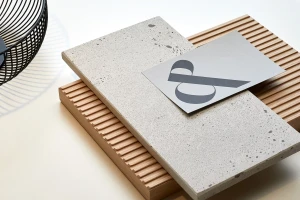
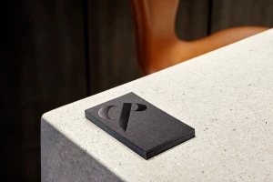
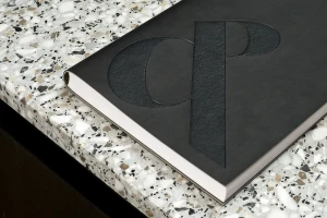
DutchScot developed the comprehensive brand identity for Conran and Partners, translating the studio’s architectural focus into a cohesive visual system. The design centers on a custom monogram and ampersand motif, applied across diverse touchpoints including corporate stationery, technical drawing sheets, and tactile brand collateral. The project utilizes a refined, monochromatic palette and minimalist typography to ground the visual language. Production techniques emphasize material contrast, featuring emboss and deboss finishes on printed materials, alongside high-contrast photography that highlights architectural textures such as terrazzo, ribbed timber, and glazed brick. By integrating bespoke graphic elements with a clean, understated application, the identity mirrors the precision and structural sensibility of the architecture firm.
Clean, Minimalist, Horizontal, Commercial
Advertising Campaign
