
Associated creatives


Tags
Description
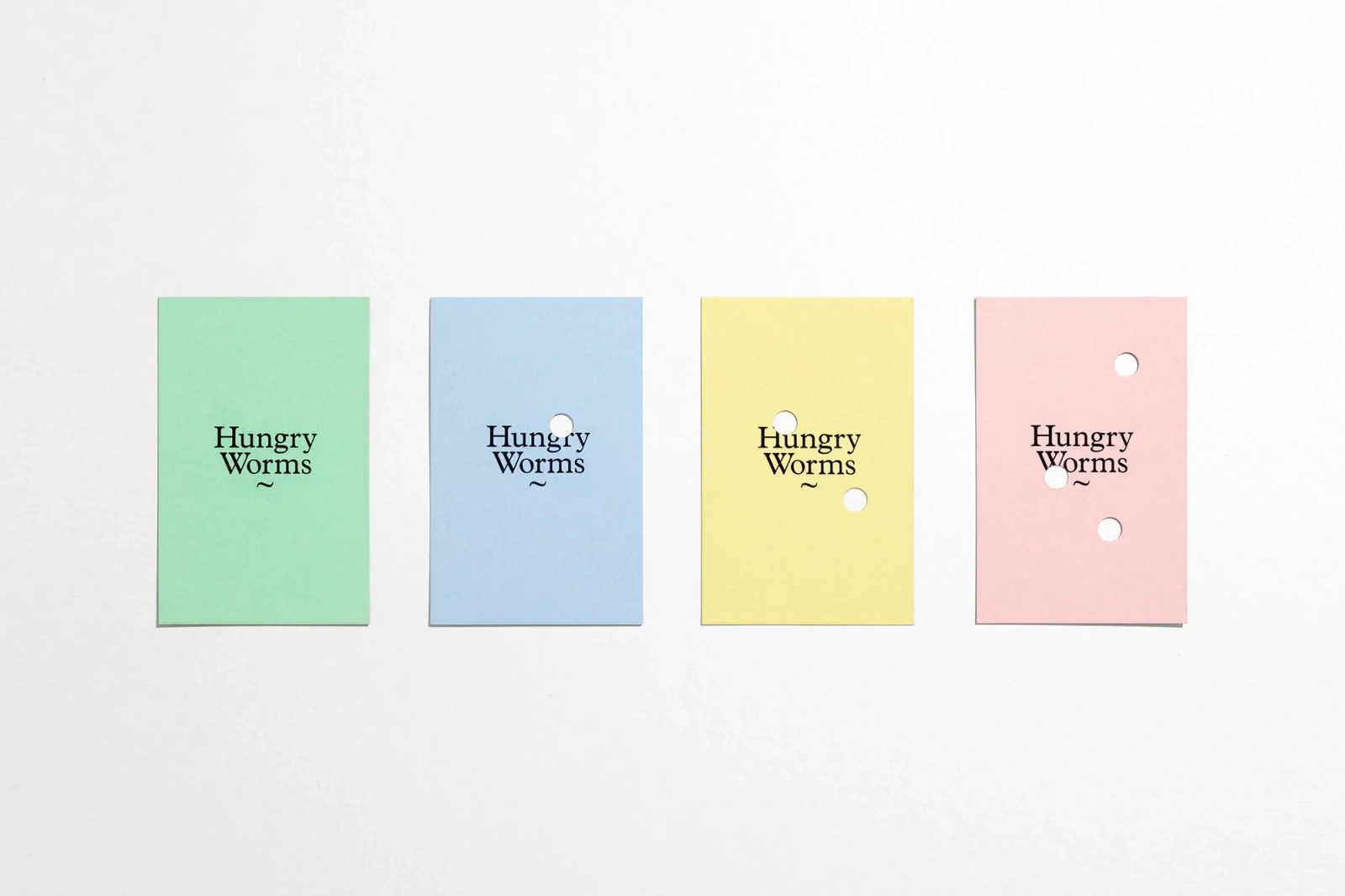
This brand identity project for Hungry Worms features a series of four rectangular pastel-colored paper cards arranged horizontally on a clean white background. Each card is printed with black serif typography reading Hungry Worms alongside a small tilde symbol. The cards showcase varying numbers of small circular punch holes reminiscent of worm tracks, progressing from a solid green card to cards with one, two, and three holes in blue, yellow, and pink respectively. The layout is captured from a direct overhead angle with soft, even studio lighting highlighting the smooth texture of the paper stock. DutchScot provided graphic design for the project, with printing by Gavin Martin Colournet.