
Brand
ProjectBrand Identity
Hungry Worms Brand Identity 2020
Associated creatives


Tags
Description
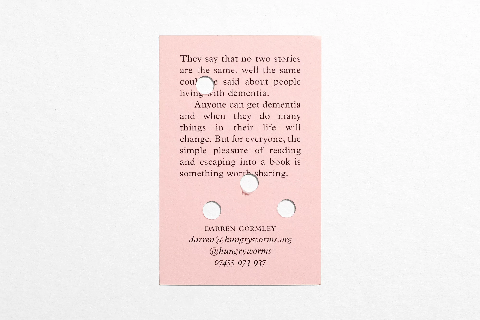
This image presents a rectangular pink card featuring printed text and four circular punched holes, showcased on a plain white background. Designed for Hungry Worms as part of their Brand Identity project, the piece incorporates typography and print production by DutchScot and Gavin Martin Colournet. The card displays paragraphs discussing the impact of dementia alongside contact information, set in a clean serif typeface. The flat lay composition emphasizes the tactile quality of the paper stock and the precise execution of the die-cut holes.