
HumanForest: Brand Identity
Jun 2020
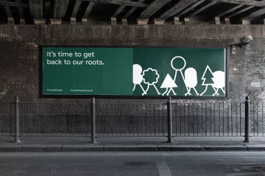
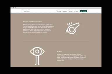
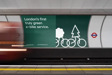
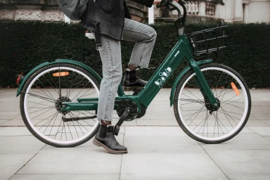
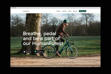
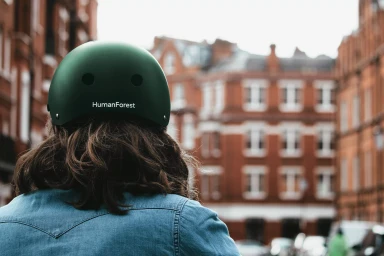
HumanForest’s recent brand identity overhaul transforms the visual language of urban transit, moving away from utilitarian cliches to embrace a more intentional, design-forward aesthetic. With graphic design led by Studio South, the identity centers on a deep, signature forest-green palette paired with minimalist typography and stylized line-art illustrations of geometric trees and bicycle wheels. This project strikes a deliberate balance between corporate accessibility and lifestyle-led storytelling, successfully positioning the e-bike service as an integral, sustainable thread in the fabric of London life. The creative team utilizes a mix of live-action technique and motion graphics to bridge the gap between static environmental installations, such as high-impact billboards in underground transit hubs, and a highly functional digital interface developed by New Territory. Whether seen through the lens of editorial animation or in the context of natural light street photography, the brand leans into a sophisticated minimalism that prioritizes safety and user experience without sacrificing visual punch. Motion work by Parallel Teeth brings the brand to life across digital touchpoints, grounding the kinetic energy of the city in a calm, coherent visual system. This comprehensive refresh demonstrates how a cohesive identity, marked by clean UI illustration and smart environmental placement, can effectively elevate a service from a mere convenience to a core element of the modern, transit-conscious urban experience.
Horizontal, Commercial, Clean


