
The International
Brand Identity
Sep 2016
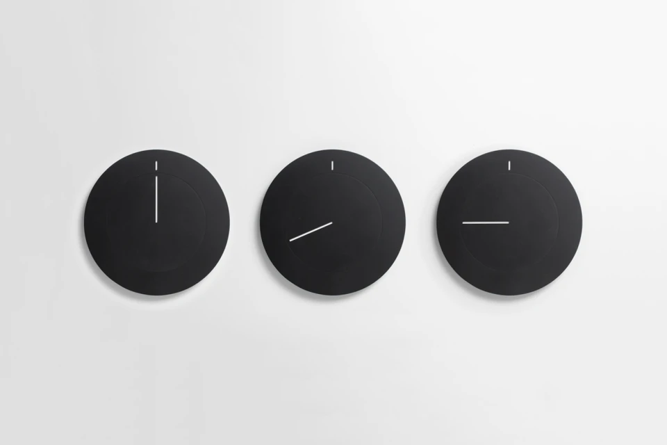
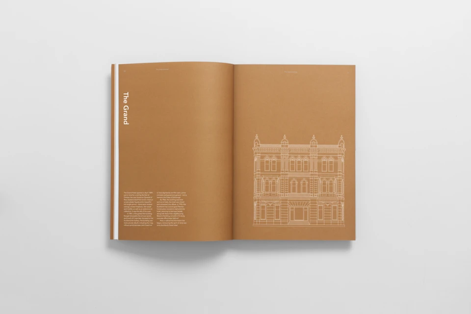
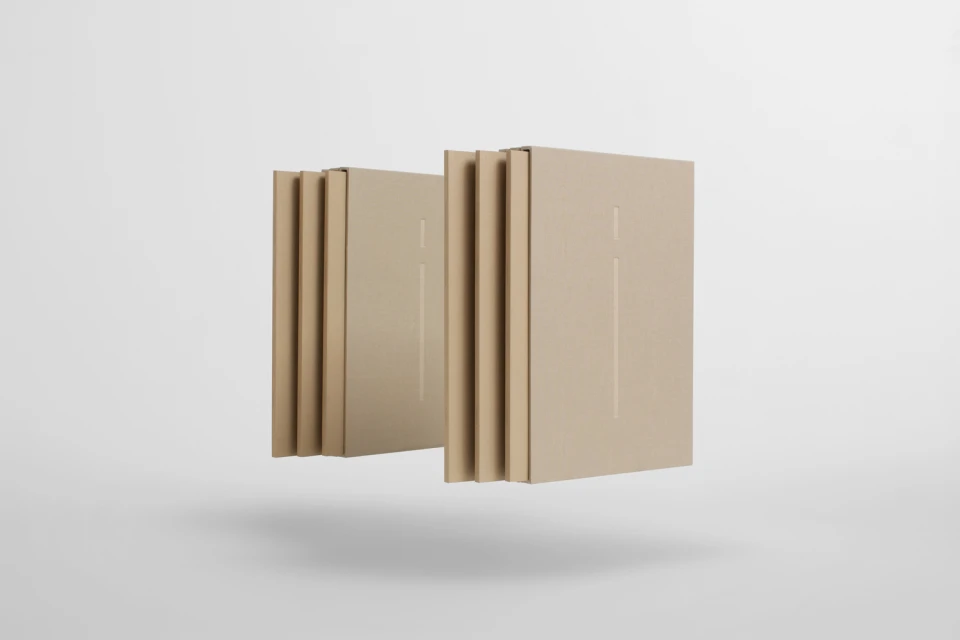
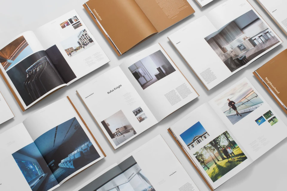
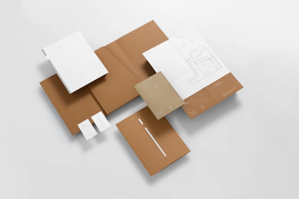
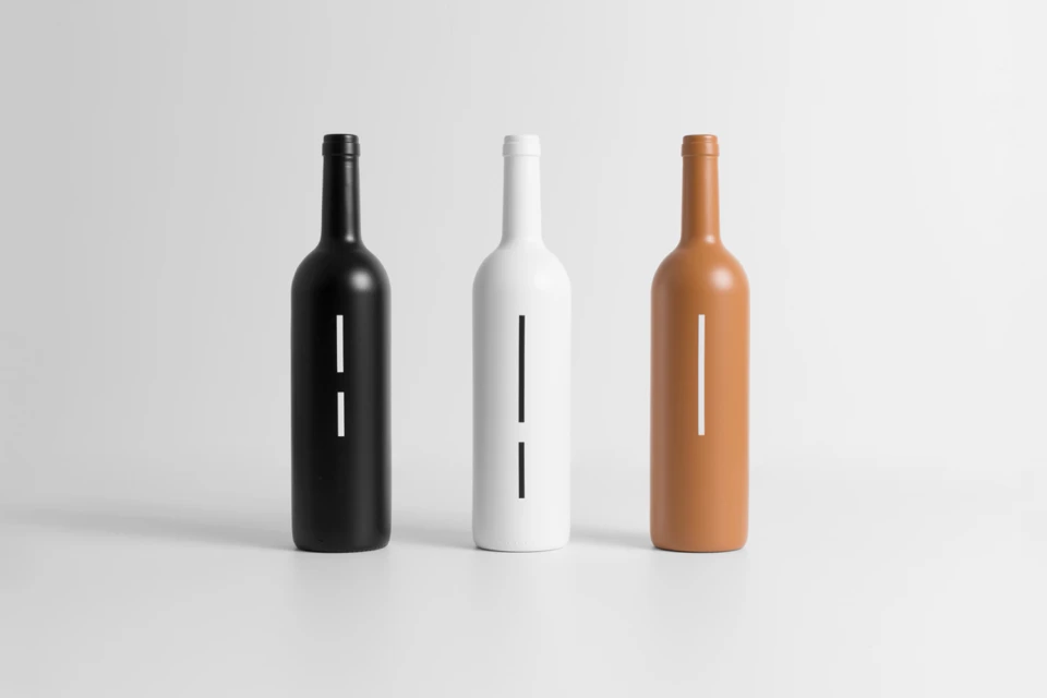
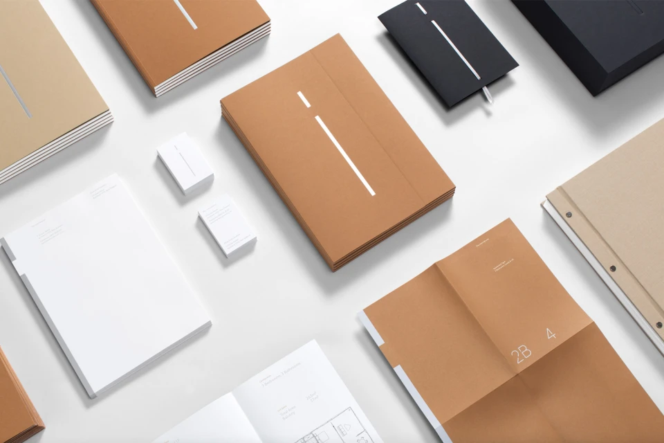
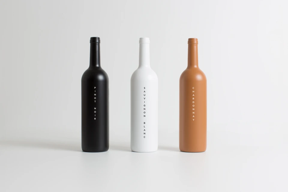
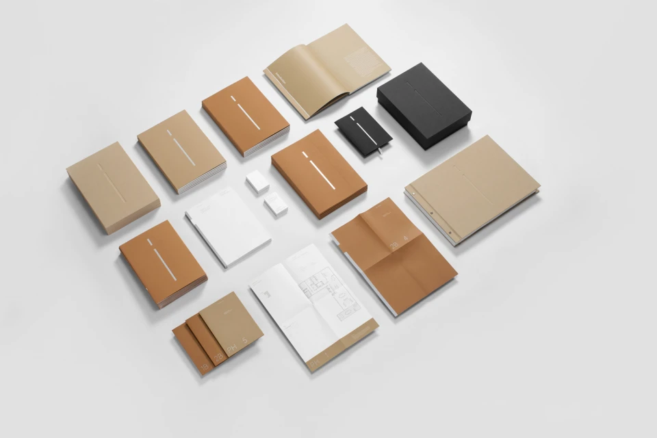
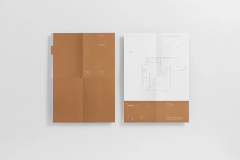
The brand identity for The International serves as a masterclass in editorial minimalism and corporate sophistication. Developed by the team at Studio South, the project establishes a cohesive design system that leans into geometric clarity and refined negative space to communicate high-end professionalism. By leveraging a restrained palette of terracotta, tan, matte black, and stark white, the work achieves a balanced, architectural aesthetic that feels both timeless and precise. The execution spans a comprehensive collection of touchpoints, from clean-lined stationery and textured paper goods to bespoke, matte-finished product packaging that utilizes high-key lighting to emphasize smooth, tactile surfaces. The design leans heavily into subtle typography and technical precision, often incorporating architectural floor plans and linear graphic accents that ground the identity in a structural reality. Through the use of studio strobe techniques and carefully composed flat lays, the identity project frames its assets—whether paper brochures or wine bottles—with a clinical, symmetrical perfection. The result is a highly organized, professional portfolio showcase that proves how effectively a consistent visual language can unify diverse collateral into a single, authoritative voice. This project avoids unnecessary ornamentation, instead finding its impact through the rhythm of its layout, the weight of its paper choices, and a disciplined application of vector typography across every piece of the brand’s expansive, monochromatic ecosystem.
Horizontal, Commercial, Clean, Minimalist
White Seamless
E-commerce / Product
