
Wilshire Group: Brand Identity

Oct 2018
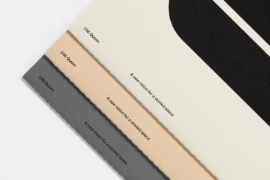
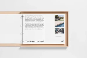
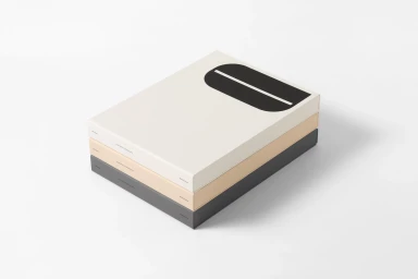
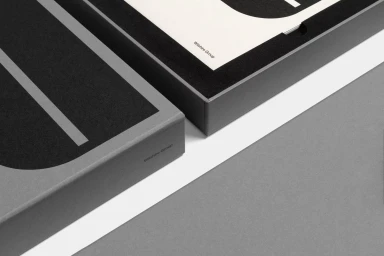
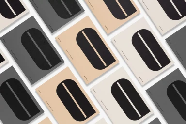
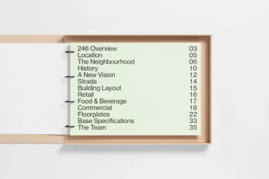
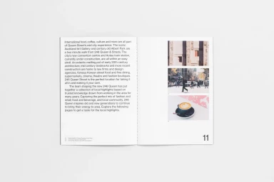
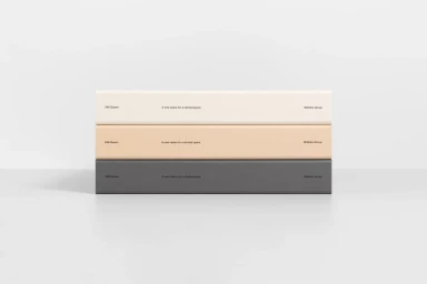
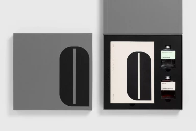
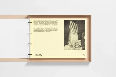
The brand identity for Wilshire Group serves as a masterclass in corporate minimalism, demonstrating how precision in graphic design can elevate commercial collateral into a tactile, high-end experience. Orchestrated by Studio South, the project leans into a sophisticated, neutral color palette of slate grey, warm beige, and crisp off-white to establish a professional yet elevated tone. The execution relies heavily on intentional typography and material depth, utilizing techniques like emboss and deboss to imbue the printed elements with a sense of permanence and quality. Throughout the series of UI illustration and print assets, the design channels a highly structured, rhythmic composition that feels both contemporary and timeless. Whether through the deliberate layout of the ring-bound neighborhood booklets or the clean, geometric precision of the presentation boxes, every element reinforces a consistent visual language. The project avoids unnecessary ornamentation, instead favoring a functional, balanced aesthetic that organizes complex information with absolute clarity. By integrating natural light and soft-focus studio photography, the identity succeeds in highlighting the physical materiality of the paper stocks and matte finishes. This is a restrained, intelligent approach to brand presentation that focuses on the interplay of shape and space, ensuring that every touchpoint—from the custom cocktail kits to the architectural brochures—communicates a clear, unified vision for a storied urban space.
Horizontal, Commercial, Clean, Minimalist
Typography
White Seamless
E-commerce / Product
