
Meg's Tailoring
Brand Identity

Jul 2016
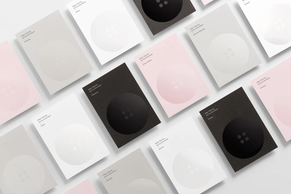
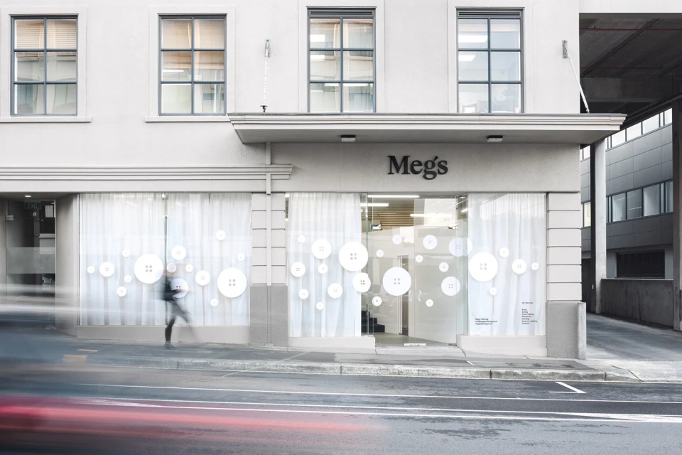
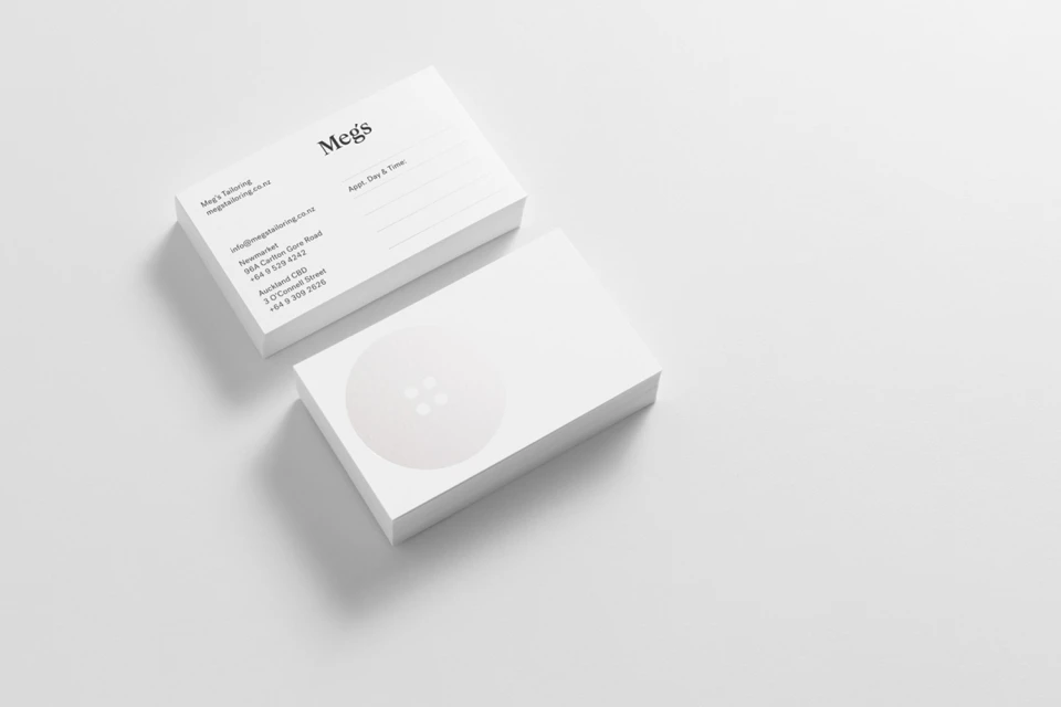
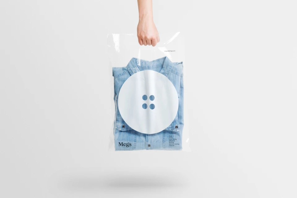
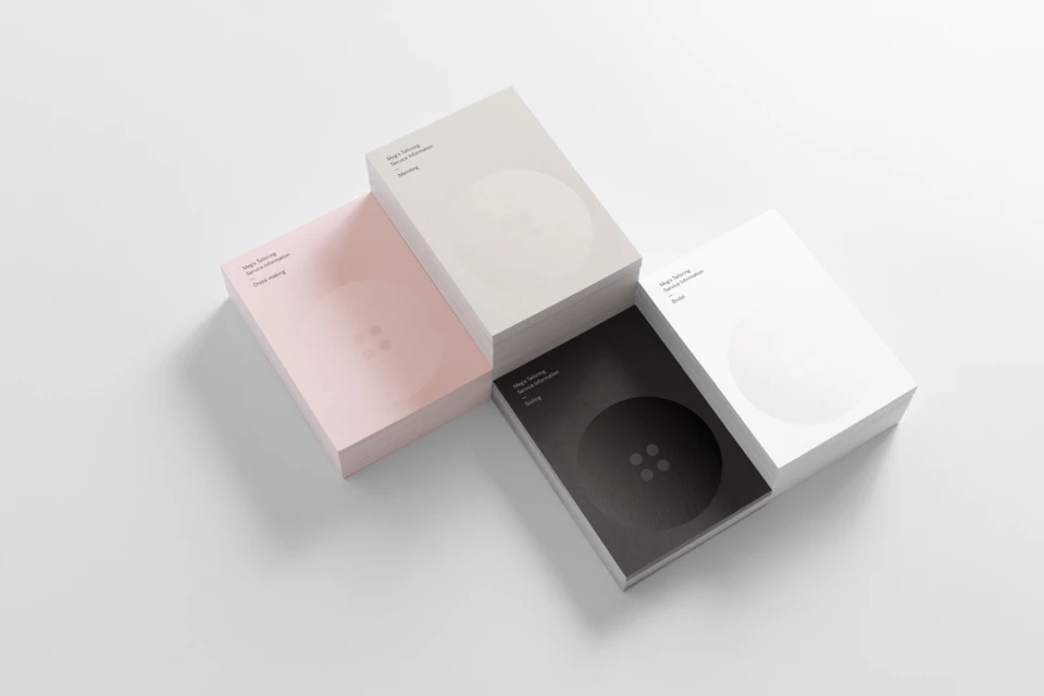
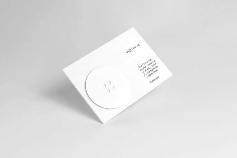
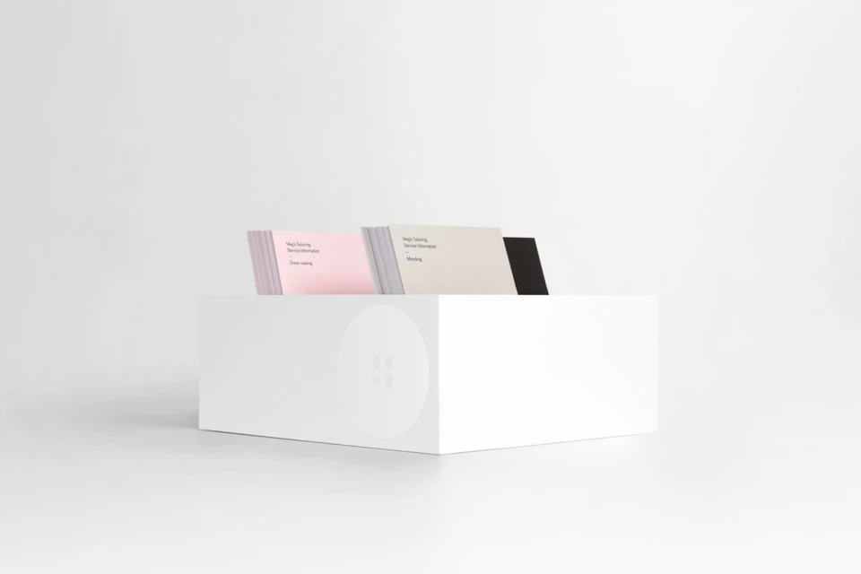
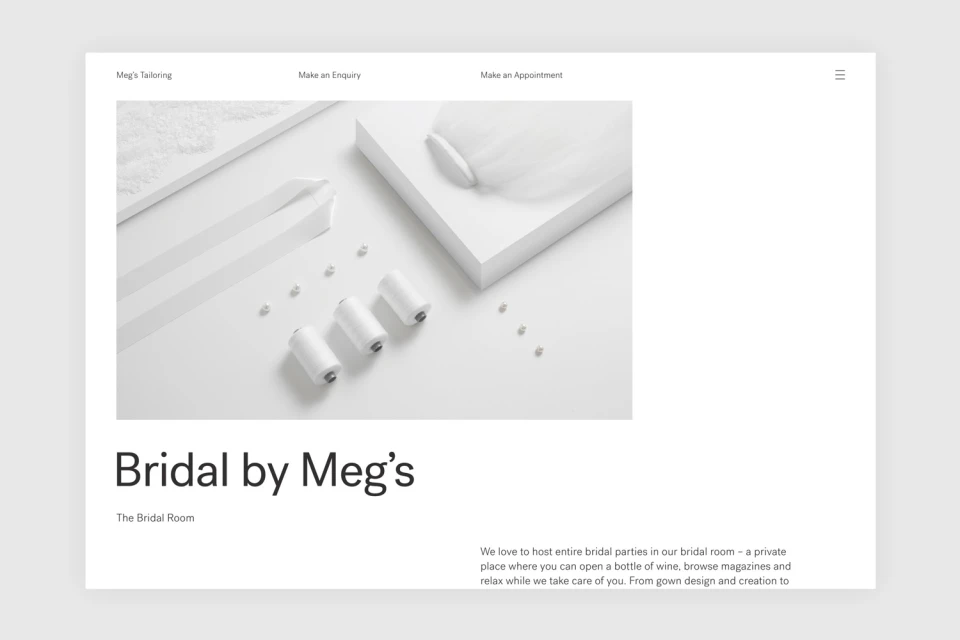
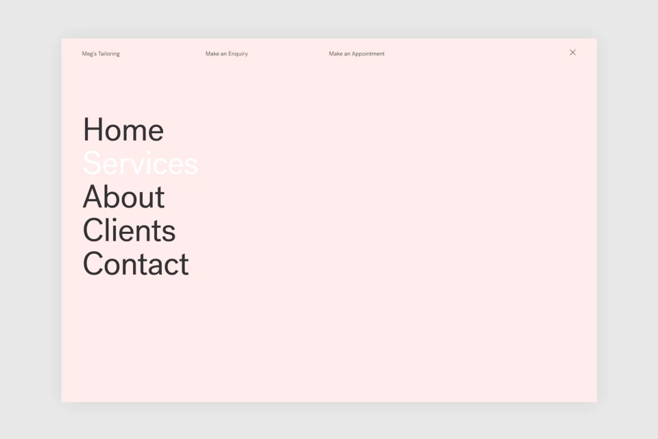
The brand identity for Meg's Tailoring serves as a masterclass in minimalist design, bridging the gap between traditional craftsmanship and modern retail aesthetics. Developed by Studio South, the visual language revolves around a clever, recurring motif: the classic four-hole button. This emblem is deployed with surgical precision, appearing as a playful, oversized graphic on storefront glass, a tactile debossed element on premium stationery, and a refined icon across digital touchpoints. The project leans heavily into a sophisticated, high-key studio aesthetic, utilizing a restrained color palette of blush pink, charcoal, and crisp white to convey a sense of professional precision. By prioritizing clean typography and balanced, symmetrical compositions, the branding effectively elevates the concept of alterations and dress-making into a high-end specialty retail experience. Whether capturing the texture of matte cardstock through controlled studio strobe lighting or integrating UI elements for a seamless web interface, the work demonstrates a cohesive approach to visual storytelling. The project channels an airy, architectural quality that feels both functional and inviting, successfully positioning Meg's Tailoring as a destination for refined craftsmanship. Ultimately, the identity succeeds by stripping away the superfluous, allowing the brand’s technical expertise to speak through sharp, intentional design choices and a consistent, polished presentation that resonates across both physical storefronts and corporate collateral.
Horizontal, Clean, Minimalist, Commercial
