Logo
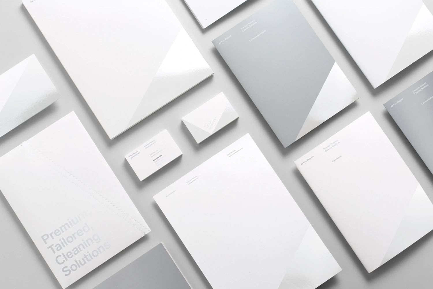
Flat lay of corporate stationery including letterheads, business cards, and folders in white and grey on a light grey surface.
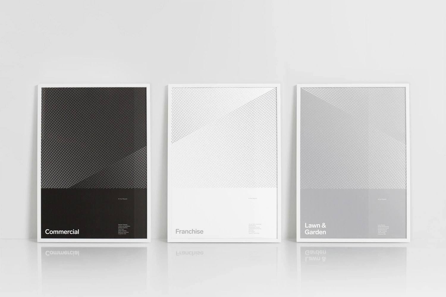
Three framed graphic posters with halftone dot patterns and typography leaning against a white studio wall.
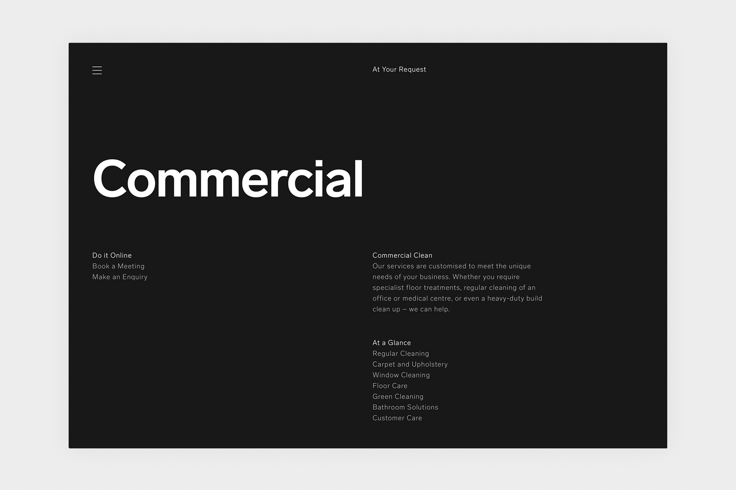
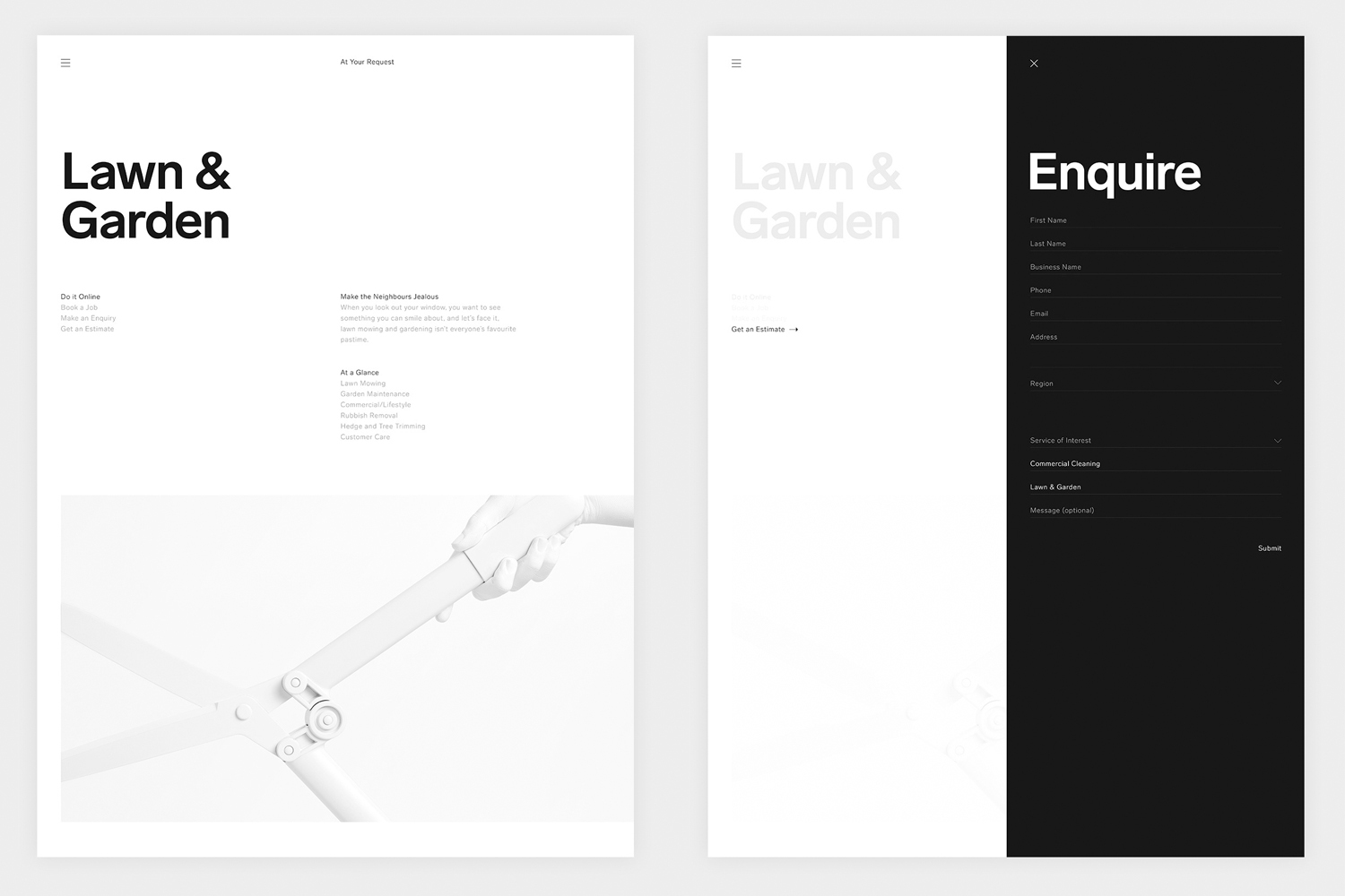
Minimalist dark website UI design layout for At Your Request brand featuring bold white typography and clean layout structure.
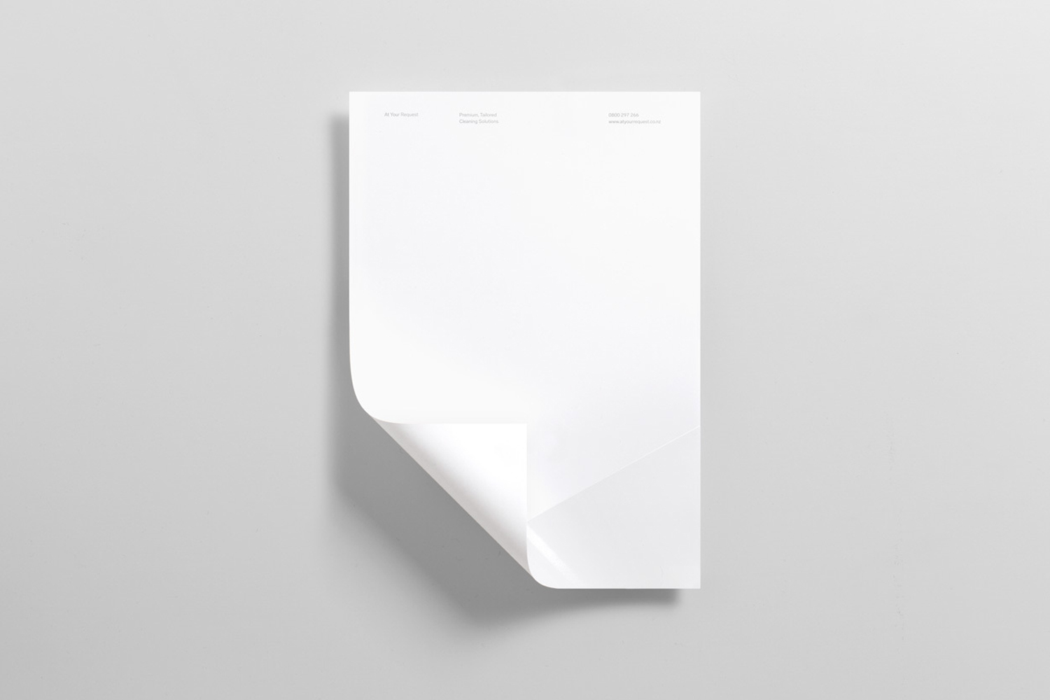
A blank white letterhead sheet with a curled bottom-left corner resting on a minimal light grey background.
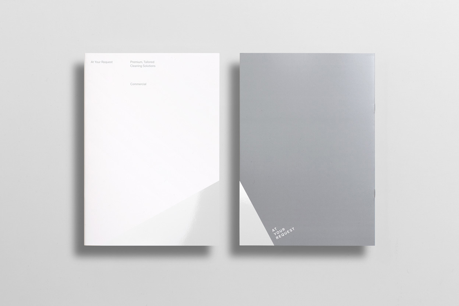
Two minimalist paper brochures with clean typography resting on a neutral grey background with soft drop shadows.
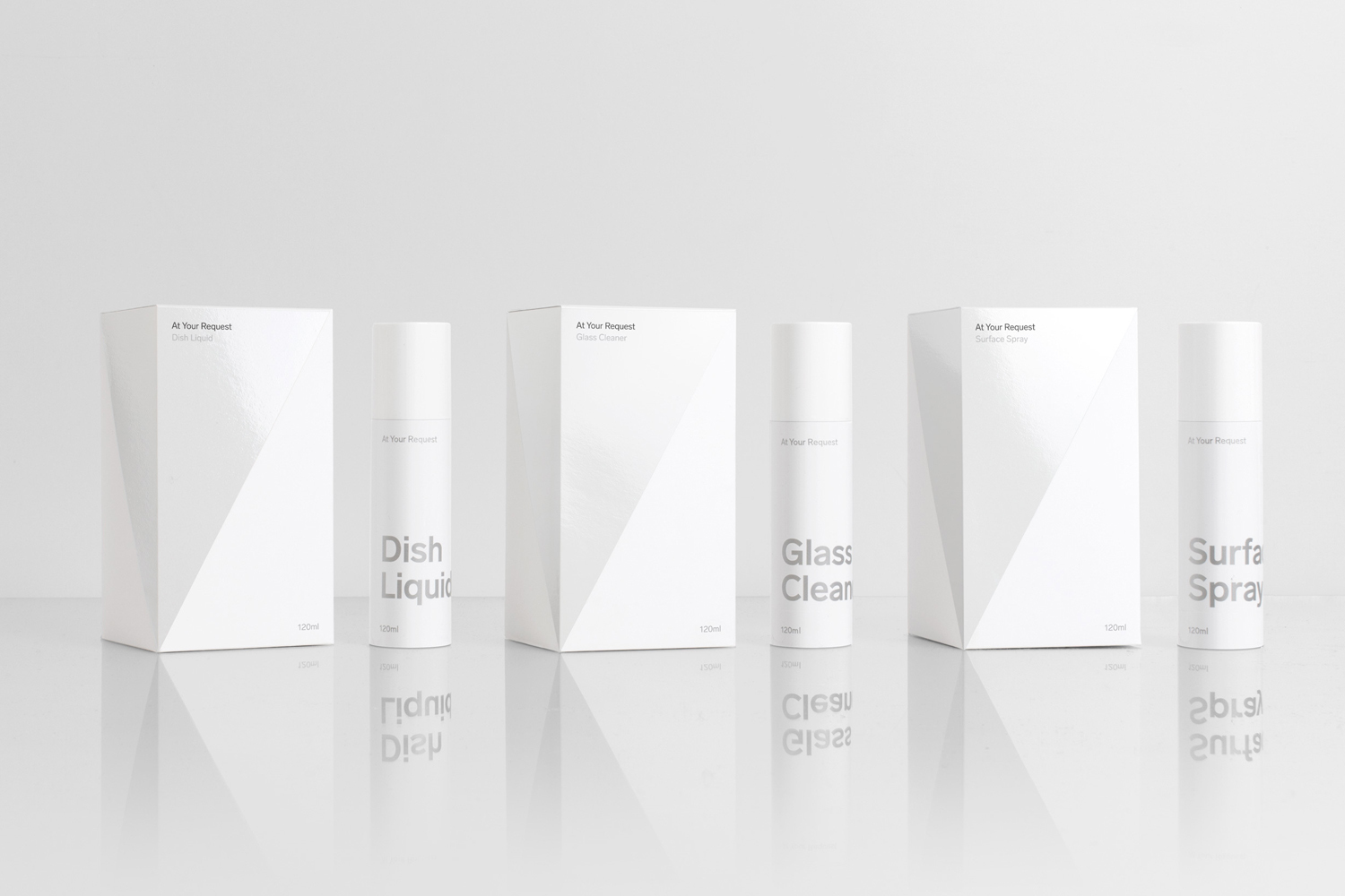
Minimalist product photography featuring white packaging boxes and spray bottles on a reflective white surface.
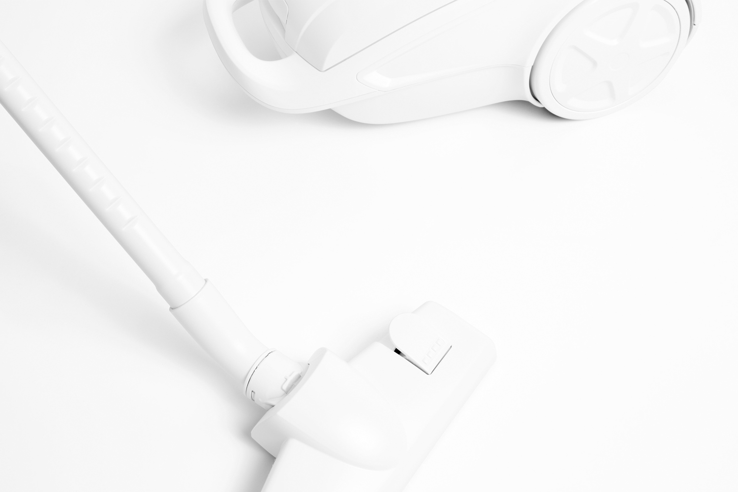
High-angle product view of a white vacuum cleaner with a long hose and floor nozzle against a white seamless background
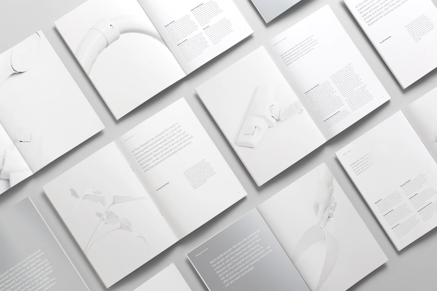
Flat lay of open brochures and manuals featuring minimalist typography and clean product photography on white background.
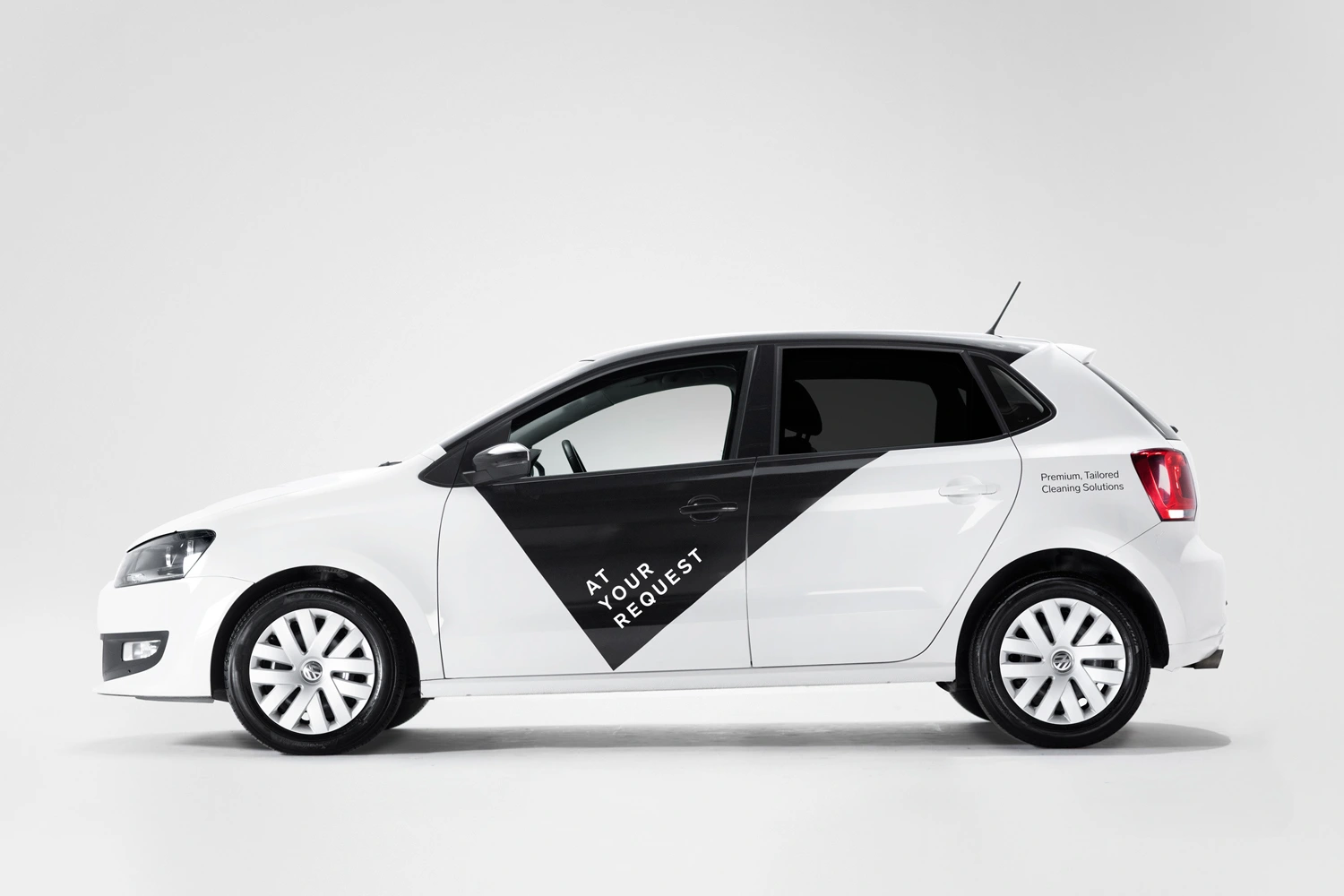
Profile view of a white hatchback car with black branded panel and At Your Request logo on a seamless white background.
Monochrome web layout displaying minimal typography, user interface design, and form enquiry elements for At Your Request.
Flat lay of corporate stationery including letterheads, business cards, and folders in white and grey on a light grey surface.
Three framed graphic posters with halftone dot patterns and typography leaning against a white studio wall.
Minimalist dark website UI design layout for At Your Request brand featuring bold white typography and clean layout structure.

At Your Request Brand Identity 2016

About

At Your Request’s brand identity project serves as a masterclass in modern corporate minimalism, effectively stripping away the visual clutter often associated with service-based industries to reveal a refined, professional core. Led by the sharp vision of Studio South, the graphic design strategy relies on a restrained palette of white, grey, and black, leveraging high-key lighting and precise studio strobe techniques to ensure each asset feels pristine and functional. From corporate stationery and editorial brochures to a cohesive digital interface and even mobile assets like the brand’s vehicle livery, every touchpoint is united by the clever use of diagonal graphic elements and clean sans-serif typography. The design language leans heavily into editorial minimalism, creating a sense of movement and order that elevates everyday cleaning services into a premium, tailored experience. The inclusion of vector graphics and structured UI illustrations reinforces this identity, proving that clarity is the ultimate luxury in commercial branding. By maintaining symmetrical, balanced compositions throughout the entire suite, Studio South has successfully crafted a brand identity that reads as highly capable and incredibly trustworthy. This project highlights the power of a cohesive system, where consistent application of typography and color—exemplified by the project’s sharp, minimalist aesthetic—builds a lasting, professional narrative for the company’s diverse service portfolio.

Brand

Credits

Styles

5000+ creatives to discover

Sign up to gain access to the entire directory. It’s free.

Visie is a curated library of creative professionals.
Trusted by