
HKUMed: Brand Identity


Oct 2020
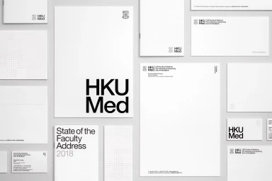
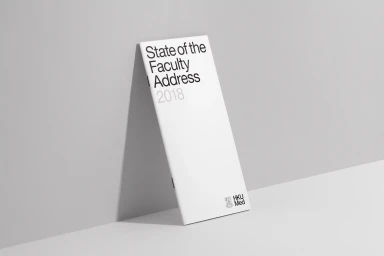
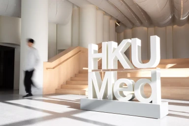
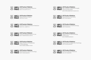
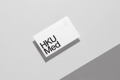
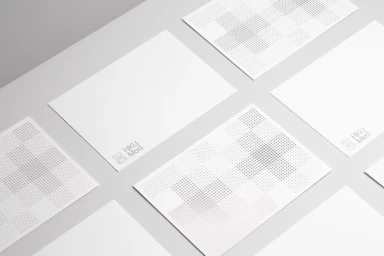
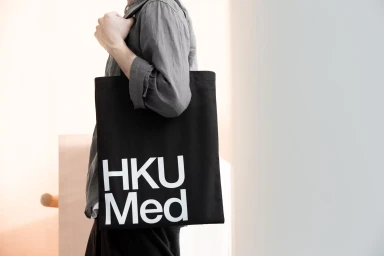
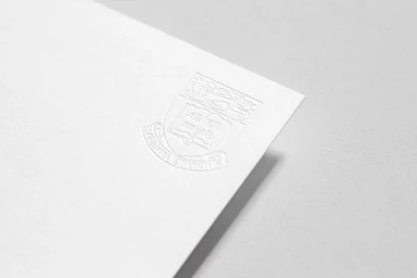
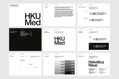
Toby Ng Design has developed a comprehensive brand identity system for HKUMed, establishing a cohesive visual language across the institution's various academic departments and research centres. The project prioritizes minimalist structure and professional clarity, utilizing a high-contrast palette and systematic typographic hierarchies to unify the faculty's diverse applications. The identity suite encompasses a full range of corporate collateral, including stationery, brochures, and branded apparel. Across the materials, the execution leans into precise editorial design, featuring the official crest alongside bold sans-serif typography. Technical applications include sophisticated emboss and deboss effects on high-quality paper stocks and clear spatial diagrams that dictate logo placement and color usage. Throughout the various visual assets, the work maintains a clean, architectural feel. The application of the system extends to environmental graphics and digital layouts, ensuring consistency from printed institutional communications to large-scale dimensional signage.
Horizontal, Commercial, Clean, Minimalist
Typography
