
Brand
ProjectBrand Identity
HKUMed Brand Identity 2020
Associated creatives

Tags
Description
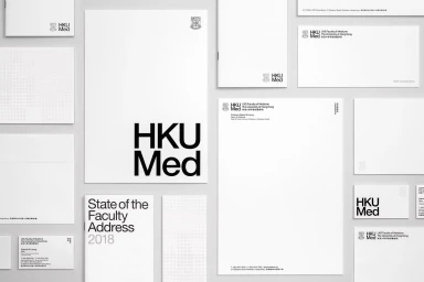
A flat lay photograph displays a comprehensive brand identity and stationery suite for HKUMed, featuring letterheads, envelopes, business cards, and brochures arranged on a neutral surface. The design emphasizes clean, bold typography utilizing the HKUMed logotype alongside minimalist grid layouts and subtle crest branding. The composition is shot from a top-down perspective with crisp, even lighting that highlights the textured white paper stocks. Created by Toby Ng Design for the Brand Identity project.