
Brand
ProjectBrand Identity
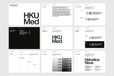
HKUMed Brand Identity 2020
Associated creatives

Tags
Description
This presentation showcases the brand identity guidelines for HKUMed, created by Toby Ng Design. The layouts feature crisp typography, clear spatial diagrams, and comprehensive rules for logo placement, minimum clearspace, and secondary signature formats. Pages detail color usage palettes and specify the Helvetica Neue typeface family as the primary English typography. The clean editorial design emphasizes minimalist structure and high-contrast black and white layouts.