
Brand
ProjectBrand Identity
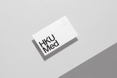
HKUMed Brand Identity 2020
Associated creatives

Tags
Description
A minimalist brand identity showcase featuring a rectangular white paper card set against a diagonally divided light grey and dark grey surface. The card displays bold, clean black sans-serif typography reading HKUMed alongside a subtle debossed emblem in the upper right corner. Soft directional lighting casts a gentle shadow beneath the card, creating depth and a clean architectural feel. The composition is captured from a straight-on overhead angle, emphasizing geometric lines and minimal styling. This brand identity project was designed by Toby Ng Design.