Herman Miller: Brand Identity
Aug 2026
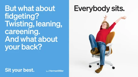
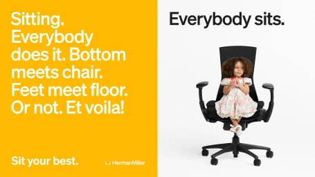
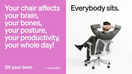
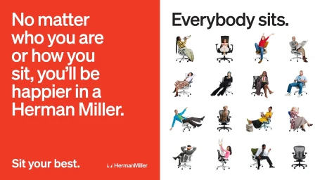
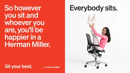
Herman Miller, a titan of industrial design, reinvents its visual language in this striking brand identity project, successfully marrying ergonomic rigor with a vibrant, human-centric energy. Through a series of high-contrast compositions, the campaign leans into a bold commercial aesthetic that prioritizes clarity and personality. The visual strategy centers on a split-screen design, utilizing an aggressive, color-blocked palette of primary reds, yellows, and pinks to house punchy, oversized typography, which sits in perfect dialogue with minimalist, studio-lit photography on the opposing side. Photographer Max Siedentopf captures a diverse range of subjects, from children to professionals, in candid, playful, and dynamic poses that underscore the versatility of the furniture. The project effectively bridges the gap between traditional corporate branding and lifestyle imagery, integrating archival, vintage-inspired animation and instructional line-art diagrams that speak to the brand's long-standing heritage. By focusing on how bodies naturally inhabit space, the work transforms office seating from purely functional hardware into an invitation for movement and comfort. The execution is polished and rhythmic, with a clean editorial minimalism that keeps the focus squarely on the product. Supported by refined design choices from Look, this cohesive campaign demonstrates how heritage brands can evolve their identity, employing a blend of live-action technique and graphic sophistication to resonate with a modern, design-conscious audience that demands both style and substance.
Commercial, Horizontal, playful, Graphic, Clean
Typography
Advertising Campaign