
Flor & Fjære: Brand Identity




Apr 2023
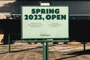
The brand identity for Flor & Fjære reflects a botanical garden experience through a multi-disciplinary visual system. Developed by Studio Oker, the identity utilizes a consistent palette of pale greens, earthy tones, and vibrant pink accents, grounded by a clean typographic approach using GT Ultra typefaces. The work integrates documentary-style photography by Anne Valeur and Tom Haga with organic, whimsical illustrations from Robert Lönnqvist, bridging a sense of natural tranquility with contemporary commercial design. From wayfinding signage and printed ephemera to outdoor advertising and motion graphics, the project maintains a cohesive aesthetic across diverse applications. The execution leans into a clean, minimalist sensibility, utilizing natural light to highlight textures across menus, stationery, and collateral. Animated components and vector illustrations introduce a lively, organic quality, balancing the brand's horticultural roots with a refined visual narrative.
Commercial, Clean, Horizontal
Natural light


