
Hamran: Brand Identity
Feb 2020
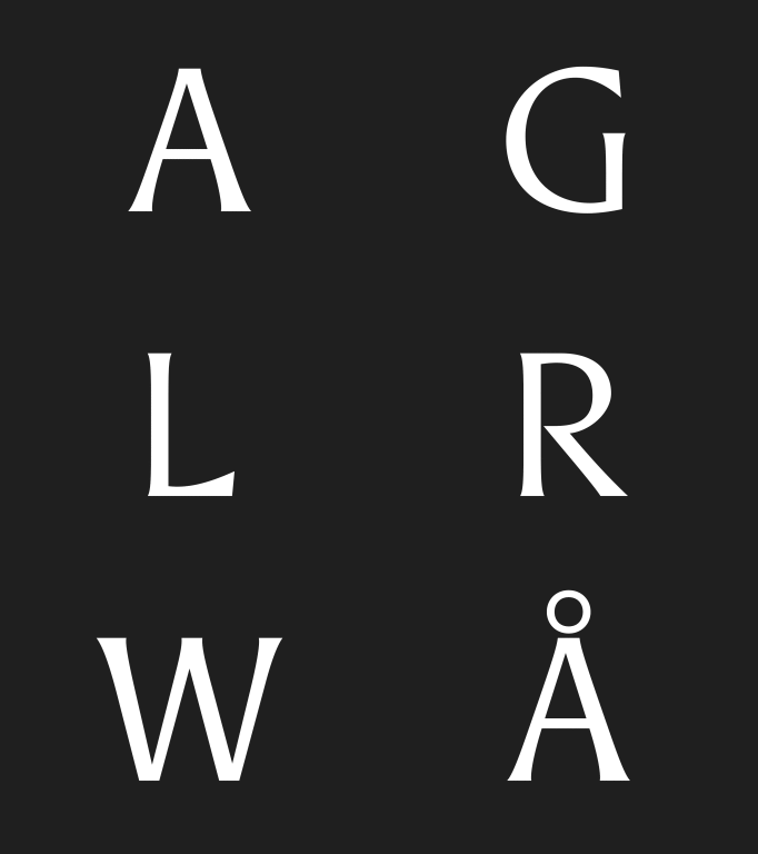
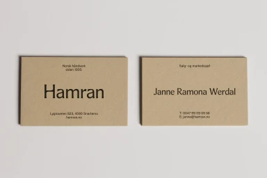
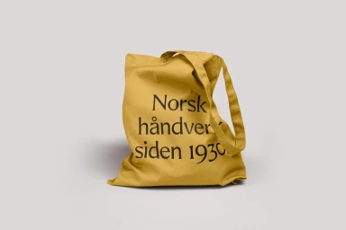
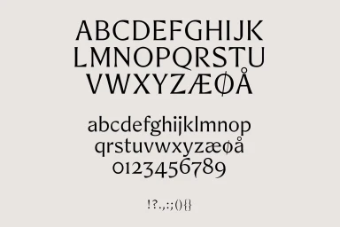
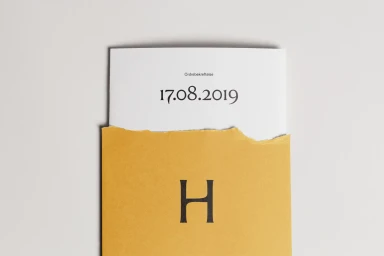
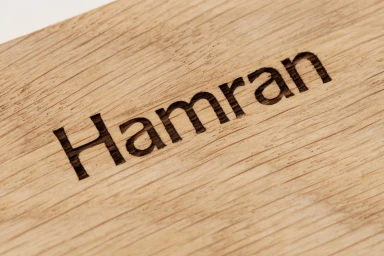
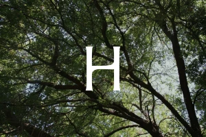
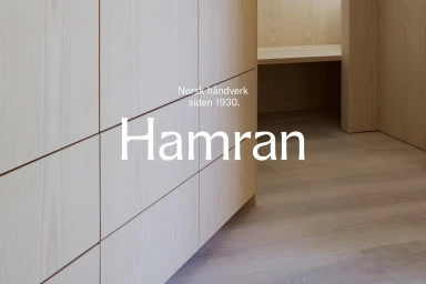
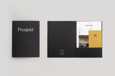
The Hamran brand identity project expertly bridges the gap between traditional craftsmanship and contemporary graphic design. Developed with meticulous attention to detail by Studio Oker, the visual system leans into a sophisticated, minimalist aesthetic that honors the brand's long-standing heritage of Norwegian woodworking, which dates back to 1930. The core of the identity is anchored in a high-contrast serif typeface that feels both timeless and highly legible, serving as a versatile anchor across diverse mediums. From laser-engraved light oak timber to matte black presentation folders and custom mustard-yellow canvas totes, the application of the typography remains consistently crisp and impactful. By juxtaposing clean, professional corporate branding with organic elements like dappled natural light and the raw texture of torn paper, the project creates a tactile narrative that elevates the brand above standard commercial work. The integration of vector-based typographic specimens alongside lifestyle photography ensures that Hamran feels grounded in real-world application, while the strict, clean layout reflects an editorial sensibility. The result is a cohesive brand identity that feels both premium and approachable, emphasizing precision, depth, and the enduring beauty of quality materials. This approach to corporate design demonstrates how a well-considered typographic system can unify disparate physical products and digital assets into a single, recognizable visual language that speaks volumes about the brand's values.
Commercial, Minimalist, Horizontal, Clean
Typography
Advertising Campaign
