
Mablis: Brand Identity
Mar 2020
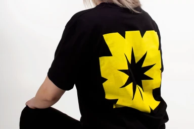
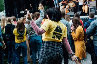
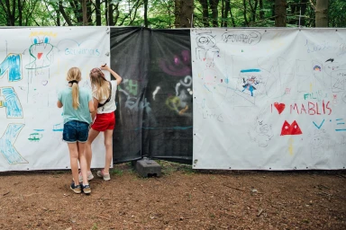
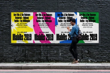
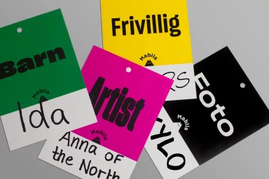
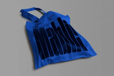
For the brand identity project of Mablis, Studio Oker has successfully synthesized a cohesive visual language that leans into the raw, communal energy of festival culture. By leveraging a palette of saturated colors and bold typography, the design team creates a recognizable aesthetic that bridges the gap between commercial merchandise and documentary-style lifestyle imagery. The project utilizes natural light to ground its visual storytelling, effectively capturing the spontaneous, tactile nature of event participation through candid moments of interaction and urban exploration. From the high-contrast presentation of screen-printed apparel to the rhythmic, geometric layouts of promotional posters, the brand identity feels both approachable and distinct. The inclusion of live-action technique in the photography captures the kinetic movement of the crowd and the organic chaos of the festival grounds, reinforcing the brand's position as a centerpiece of the musical experience. Every element, from the utilitarian yet vibrant identification badges to the carefully composed product shots, demonstrates a deliberate focus on typography and graphic design, ensuring that Mablis remains a consistent presence across diverse touchpoints. This work stands as a testament to the power of a unified design system, where editorial photography and meticulous brand assets converge to build a lasting sense of community, proving that even the most functional event materials can carry significant cultural weight through thoughtful, deliberate creative execution.
Clean, Commercial, Horizontal
Advertising Campaign
