
Okse: Brand Identity
Brand
Date
Mar 2021
Description
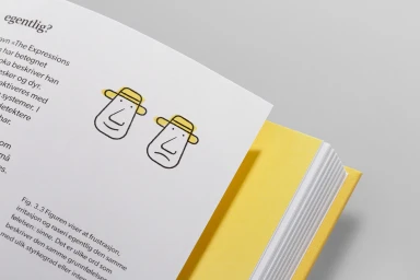
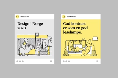
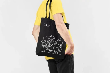
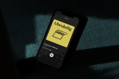
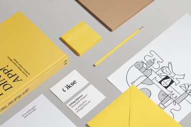
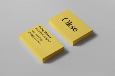
The brand identity for Okse establishes a visual language centered on minimalist layouts and a high-contrast palette of vibrant yellow and neutral grey. Developed by Studio Oker, the project integrates bold serif typography with playful line art illustrations by Jay Cover to create a cohesive aesthetic across diverse touchpoints. The system extends across print and digital media, featuring clean book design, custom stationery, and social media mockups. By balancing tactile paper textures with crisp vector graphics, the identity maintains a consistent look whether applied to apparel, mobile interfaces, or corporate collateral.
Style
Horizontal, Commercial, Clean, Minimalist
Color
Golden Yellow
Associated creatives


5000+ creatives to discover
Sign up to gain access to the entire directory. It’s free.
Visie is a curated library of creative professionals.